BITQ

For the BiTQ Website Revamp project, I transformed an outdated and user-unfriendly site into a powerful client attraction tool. The challenge was clear: poor navigation and an uninspiring design held BiTQ back. With user feedback and analytics, I identified key pain points and, in collaboration with BiTQ stakeholders, set clear goals. We aimed for a modern design that communicated BiTQ's expertise in data engineering and AI compellingly. I crafted wireframes and mock-ups, ensuring intuitive navigation and sleek design.

The content strategy was crucial. By developing engaging copy and multimedia, we highlighted BiTQ's success stories and industry expertise. Rigorous testing ensured functionality across devices and browsers, and user feedback guided iterative improvements. The revamped website now effectively showcases BiTQ's capabilities, attracting new clients and demonstrating their competitive edge. This project revitalised BiTQ's digital presence, making it a testament to their expertise and a magnet for growth.

Challenges

Click here to browse project notes

BiTQ, a technology consultancy in Brisbane, has an outdated website with poor navigation and unattractive design. These issues make it hard for BiTQ to show its expertise, which affects client acquisition and project engagement. This problem prevents BiTQ from growing and competing effectively in the technology consultancy industry.

Bitq Challenges

Solution

To solve these problems, we plan a complete website revamp. We will carefully analyse the current website to find user experience issues and design flaws. Using critical thinking and design thinking principles, we will create a strategic plan to improve navigation, aesthetics, and content presentation. We will design wireframes and mock-ups that focus on easy navigation, modern looks, and clear information about BiTQ's services and successful projects in data engineering and AI. This revamped website will attract new clients, show BiTQ's leadership in the industry, and support business growth and success.

Bitq Solution

Approach

Our approach to revamping BiTQ's website starts with comprehensive research and analysis, identifying key pain points like poor navigation and outdated aesthetics through user feedback and analytics. By collaborating with stakeholders, we set clear goals to enhance navigation, modernise visual design, and improve client acquisition. Employing a user-centric design methodology, we create wireframes and prototypes focused on intuitive navigation and responsive design. Our content strategy highlights BiTQ's expertise in data engineering and AI, ensuring well-organised, compelling content. Through meticulous development and testing, we ensure functionality and usability across all devices. Post-launch, we monitor performance using defined KPIs, making iterative improvements to maintain the website's effectiveness in attracting new clients and showcasing BiTQ's capabilities.

Bitq Approach

Website Analysis

Existing Problems

During my evaluation of the current BiTQ website, I identified several key issues that need addressing. Firstly, users find it difficult to navigate due to unclear menus and links. Secondly, the website's design is outdated and does not reflect BiTQ's expertise in data engineering and AI, impacting user experience negatively. Additionally, the site fails to engage users effectively, resulting in a high bounce rate. Lastly, there is a lack of clear information hierarchy, making it hard for users to find the information they need. Addressing these issues will significantly improve the user experience and better represent BiTQ's strengths.

Poor Navigation:

Users struggle to navigate through the website due to unclear menus and navigation links.

Lack of intuitive pathways makes it challenging for users to find relevant information easily.

Poorly Designed:

The website lacks modern aesthetics and fails to reflect BiTQ's expertise in data engineering and AI.

Visual elements are outdated, impacting the overall user experience negatively.

Lack of User Engagement:

Users do not engage with the website's content effectively, leading to a high bounce rate.

The website fails to captivate users' interest and encourage interaction or exploration.

Lack of Information Architecture:

The website lacks a clear information hierarchy, making it difficult for users to understand the organisation of content.

Users struggle to locate specific information or services due to the absence of a well-defined architecture.

Users Unable to Get Much Information from Homepage:

The homepage fails to provide sufficient information about BiTQ's services, expertise, and successful projects.

Users are unable to grasp the breadth of BiTQ's offerings from the homepage alone.

Users' Attention Gets Distracted Due to External Links:

The inclusion of external links, such as the LinkedIn link on the homepage, diverts users' attention away from BiTQ's website.

This distracts users and diminishes the focus on BiTQ's core content and offerings.

User Confusion with Website Layout and Sitemap:

Users experience confusion with the website's layout and sitemap, resulting in difficulty navigating between pages.

Lack of clarity in the website's structure contributes to user frustration and a poor overall experience.

Bitq Website Analysis

Design Solutions

Revamp Navigation:

Implement clear and intuitive navigation menus and links to enhance user navigation experience.

Prioritise accessibility and ease of use by organising content logically and hierarchically.

Redesign for Modern Aesthetics:

Update the website's design to reflect a modern, professional aesthetic that aligns with BiTQ's expertise.

Incorporate visually engaging elements and typography to enhance user engagement and appeal.

Enhance User Engagement:

Introduce interactive elements such as animations, videos, or infographics to increase user engagement and retention.

Encourage user interaction through clear calls-to-action and prompts for exploration.

Implement Clear Information Architecture:

Define a clear information architecture with well-structured menus and categories to facilitate easy content discovery.

Organize content hierarchically based on relevance and priority to streamline user navigation.

Optimise Homepage Content:

Enhance the homepage to provide a comprehensive overview of BiTQ's services, expertise, and successful projects.

Highlight key offerings and achievements prominently to capture users' attention and interest.

Minimise External Distractions:

Remove or minimise external distractions such as unnecessary links that divert users' attention away from BiTQ's core content.

Maintain focus on BiTQ's offerings and value proposition throughout the website.

Clarify Website Layout and Sitemap:

Simplify the website's layout and sitemap to improve user comprehension and navigation.

Clearly label menus and links, and provide visual cues to guide users seamlessly through the website.

Interview Findings

For our research phase, we conducted in-depth user interviews with individuals like Joanna, a Senior Data Scientist & AI Engineer, to gather valuable insights specific to BiTQ's website. These interviews were conducted both in-person and remotely, allowing us to understand users' browsing experiences and frustrations with the current website's navigation and aesthetics. Through structured questions and active listening, we gained nuanced feedback on how the website fails to effectively showcase BiTQ's expertise in data engineering and AI, hindering client acquisition and engagement. These insights served as a foundation for our redesign strategy, guiding us in addressing the key pain points identified during the interviews.

Top 5 user feedbacks

"The website layout feels cluttered and confusing. It's hard to find what I'm looking for, and I often end up getting lost in the navigation."

"I find the design of the website outdated and unappealing. It doesn't reflect the professionalism and expertise I would expect from a technology consultancy."

"The lack of clear navigation menus makes it frustrating to navigate through the website. I wish there were more intuitive pathways to guide me to the information I need."

"As a potential client, I struggled to understand the services offered by BiTQ due to the disorganised presentation of content on the website. It would be helpful if the information were structured more logically."

"I visited the website hoping to learn more about BiTQ's expertise in data engineering and AI, but I left feeling disappointed and confused. The website failed to effectively showcase their capabilities and successful projects."

Bitq Interview Findings

Competitive Analysis

To analyse BiTQ's competitors—Brennan, Cognizant, Servian, and KJR—I reviewed each company's website, focusing on design hierarchy, user engagement, accessibility, readability, and responsiveness. I identified key strengths and weaknesses, such as visual appeal, ease of navigation, and design issues. I then summarised these findings into SWOT analyses, highlighting each competitor's strengths, weaknesses, opportunities, and threats. Using these insights, I reviewed the design elements and incorporated the best practices into BiTQ's website to enhance its overall user experience and competitive edge.

Brennan (Link to Website)

Strengths

Logical site map and navigation

User-friendly interface with human-centred visuals

Consistent design and strong design system

Clear information hierarchy and easy readability

Engaging user experience

Weaknesses

Some colours do not meet accessibility standards (WCAG)

Responsiveness needs improvement, especially on different screen sizes

Design doesn't smoothly adapt to varying screen sizes

Opportunities

Improve accessibility by addressing colour contrast issues

Optimise responsiveness for better performance on mobile devices

Innovate design to stay current with trends and technologies

Threats

Competitive pressure from rivals with more accessible and responsive websites

Rapid technological advancements may quickly age the current design

Evolving user expectations could lead to dissatisfaction

Cognizant (Link to Website)

Strengths

Great information architecture with a logical site map

Cohesive and consistent design throughout the website

Responsive design that adapts well to different screen sizes

User-friendly navigation

Human-centred visuals and accessible colour scheme

Weaknesses

Field boxes are too large, potentially overwhelming users

Information presentation can be overwhelming, lacking sufficient spacing

Moving backgrounds may cause fatigue and distract users

Font sizes on cards may be too large, lacking adequate negative space for comfortable reading

Opportunities

Refine field box sizes for improved usability

Simplify information presentation to reduce user overwhelm

Optimise design elements to reduce user fatigue from moving backgrounds

Adjust font sizes and spacing on cards for better readability and user comfort

Threats

Competitive pressure from competitors with more refined and user-friendly designs

Rapid technological advancements may outdate current design practices

Evolving user expectations regarding usability and aesthetics

Bitq Competitive Analysis

Servian

Strengths

Logical information categorisation

Visually appealing design

Cohesive design concepts using similar symbols and colour schemes

Great breathable negative space for users to read content

Weaknesses

Colour palette does not pass accessibility tests

Black background with grey fonts makes text hard to read

Visuals lack human-centred engagement

Paragraph font size is hard to read

Opportunities

Improve accessibility by adjusting the colour palette and font sizes

Enhance visuals to be more engaging and human-centred

Provide additional information and explanations through visuals

Redesign the footer to improve readability and accessibility

Threats

Competitors with more accessible designs may attract more users

Users may prefer websites with better readability and engaging content

Accessibility issues could lead to legal challenges or penalties

Potential loss of users due to readability and engagement issues

KJR (Link to Website)

Strengths

Hero section with great design hierarchy

Light animation implementation

Font size easy to read

Design is responsive and adapts to different screen sizes

Weaknesses

Website not engaging with users

Information cards are overwhelming with information

Design alignments and padding are off

Responsiveness design issues, with some buttons and fonts overlapping

Opportunities

Enhance user engagement through interactive elements

Simplify information cards to make content more digestible

Improve design alignments and padding for a cleaner look

Fix responsiveness issues to ensure seamless user experience across devices

Threats

Competitors with more engaging websites may attract more users

Overwhelming information can lead to user frustration and higher bounce rates

Design misalignments can create a negative user impression

Responsiveness issues might cause users to prefer more reliably designed websites

Bitq Competitive Analysis

User Persona

Senior Data Scientist & AI Engineer: Joanna Iwinski

Joanna Iwinski, a 37-year-old Senior Data Scientist & AI Engineer based in Sydney. With a Master's degree in Data Science and over 10 years of experience in the field, Joanna values efficiency and precision. However, she often finds herself frustrated with poorly designed websites that hinder her ability to access relevant information quickly. Joanna prefers websites that offer well-structured content and seamless navigation across both desktop and mobile platforms. She expects a professional website experience that aligns with her expertise and enables her to accomplish tasks efficiently.

Bitq User Persona

Business Goals & Features

Business Goal

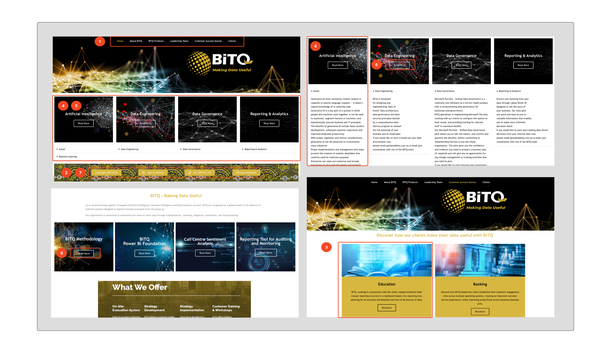
Increase client acquisition: The primary objective is to enhance the existing website to improve navigation and aesthetics, ultimately attracting new clients and projects for BiTQ.

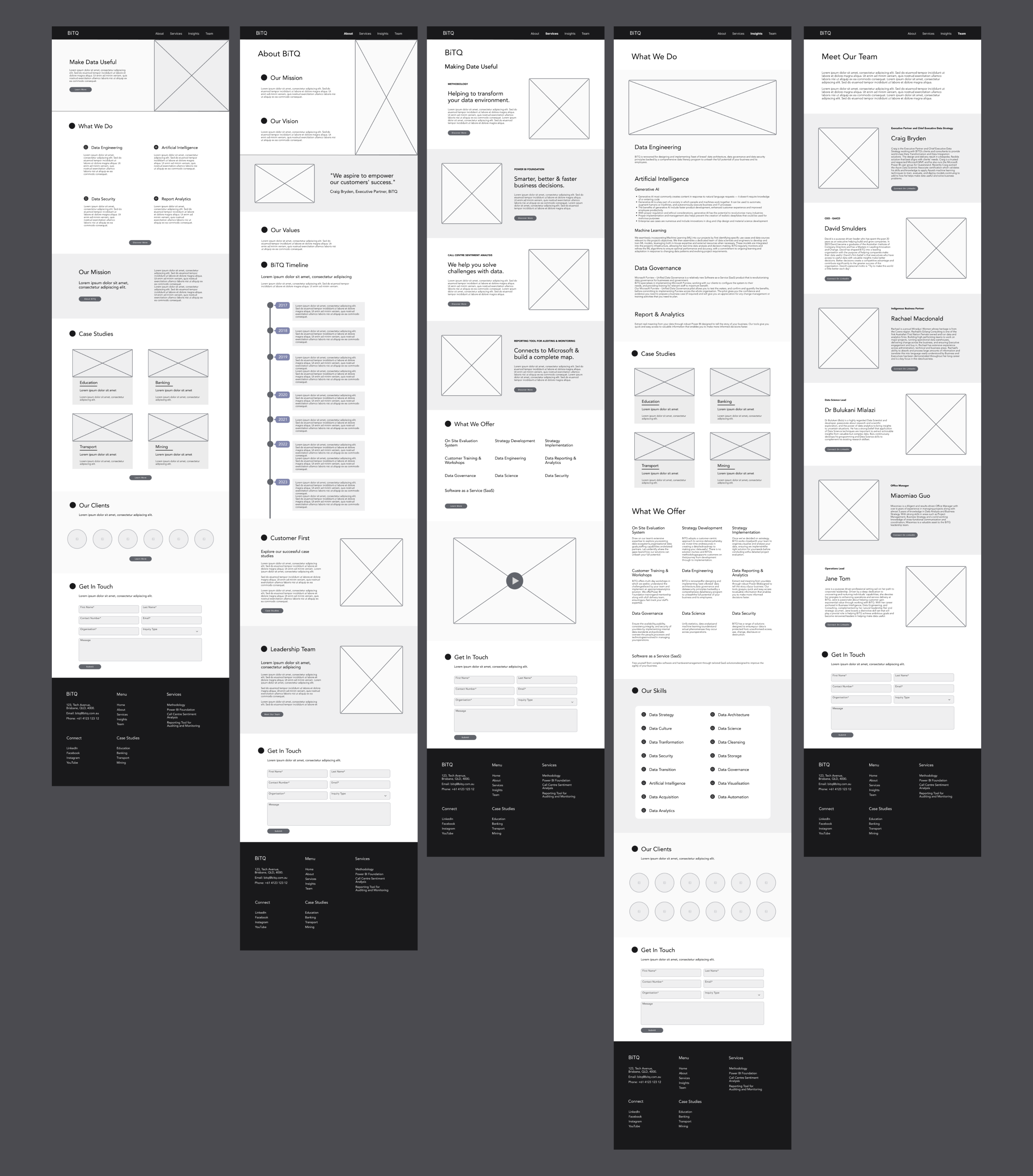
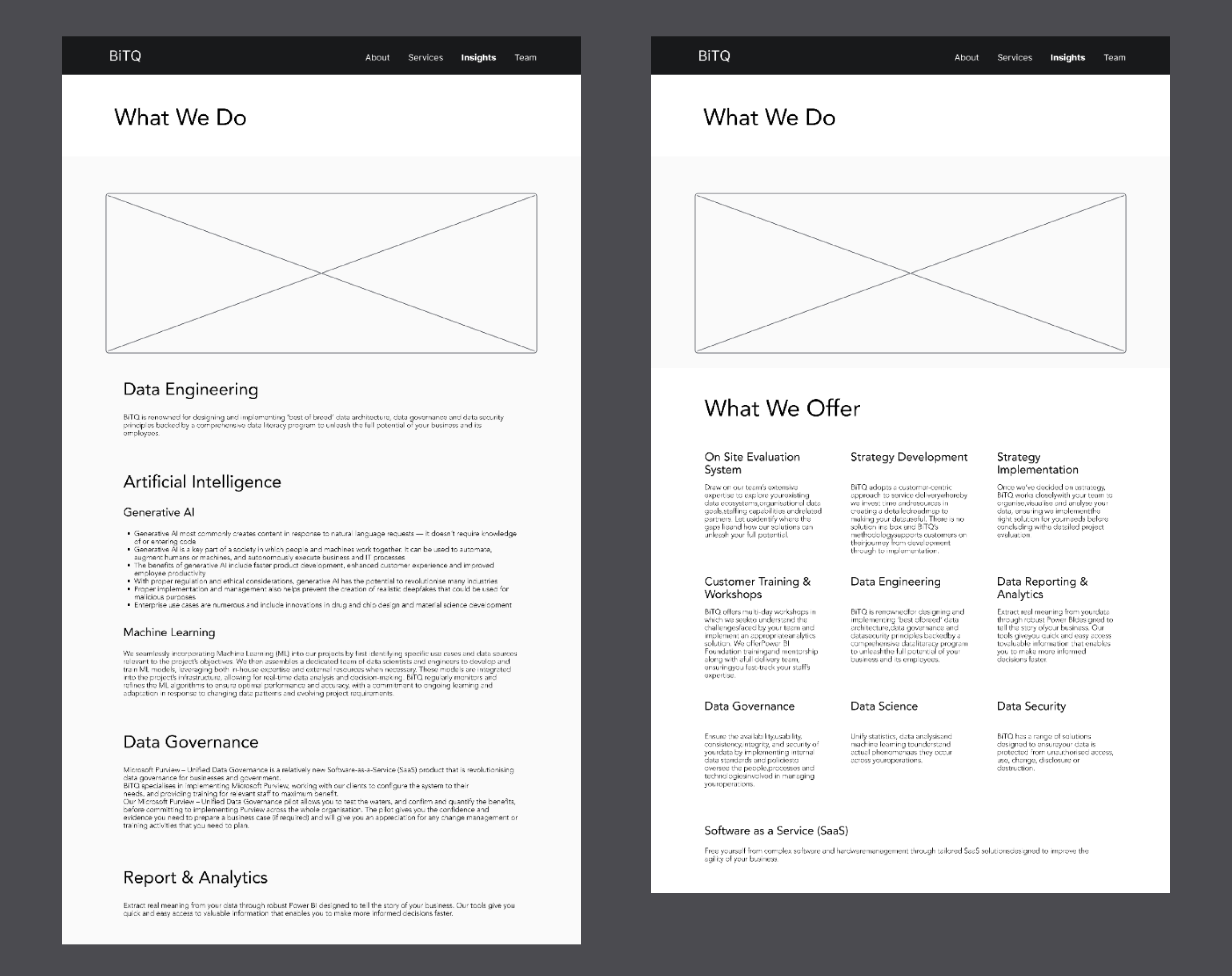
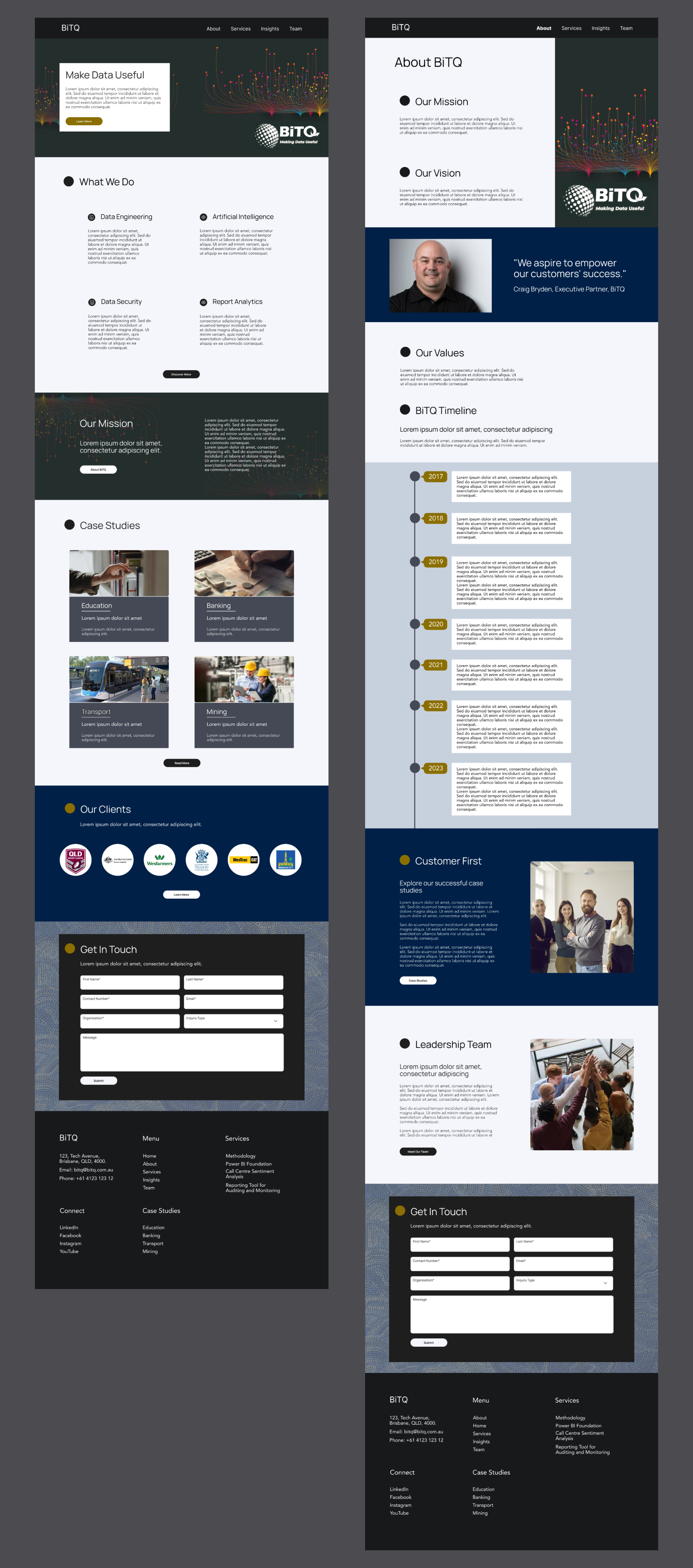
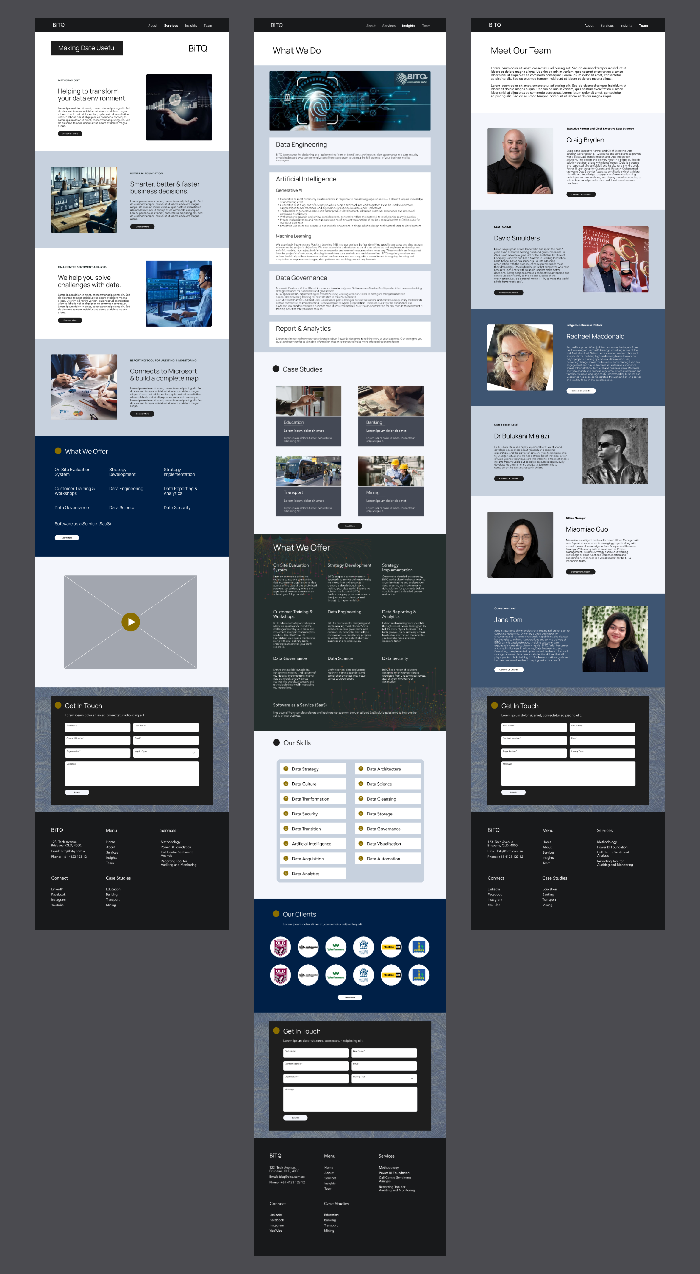
Showcase expertise: Highlight BiTQ's proficiency in data engineering and AI through case studies and clear presentation of services.

User Goal

Find information easily: Users should be able to navigate the website effortlessly to find information about BiTQ's services, expertise, and successful projects.

Understand BiTQ's capabilities: Visitors should leave the website with a clear understanding of BiTQ's competencies in data engineering and AI.

Engage with case studies: Users should be able to explore case studies seamlessly, gaining insights into BiTQ's successful projects and solutions.

Common Goal

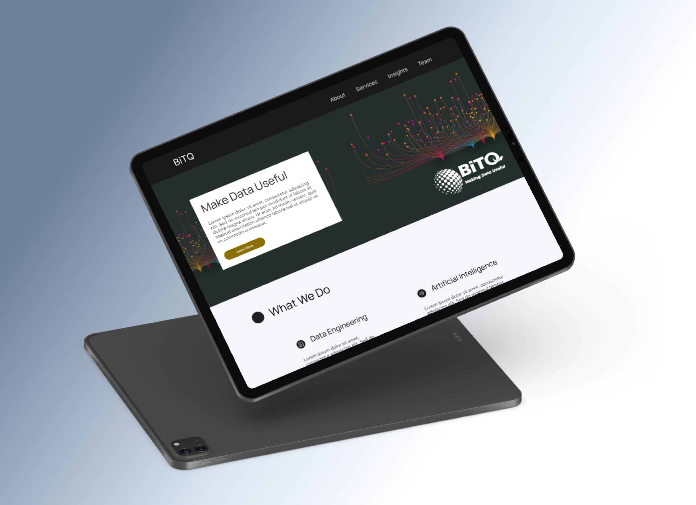
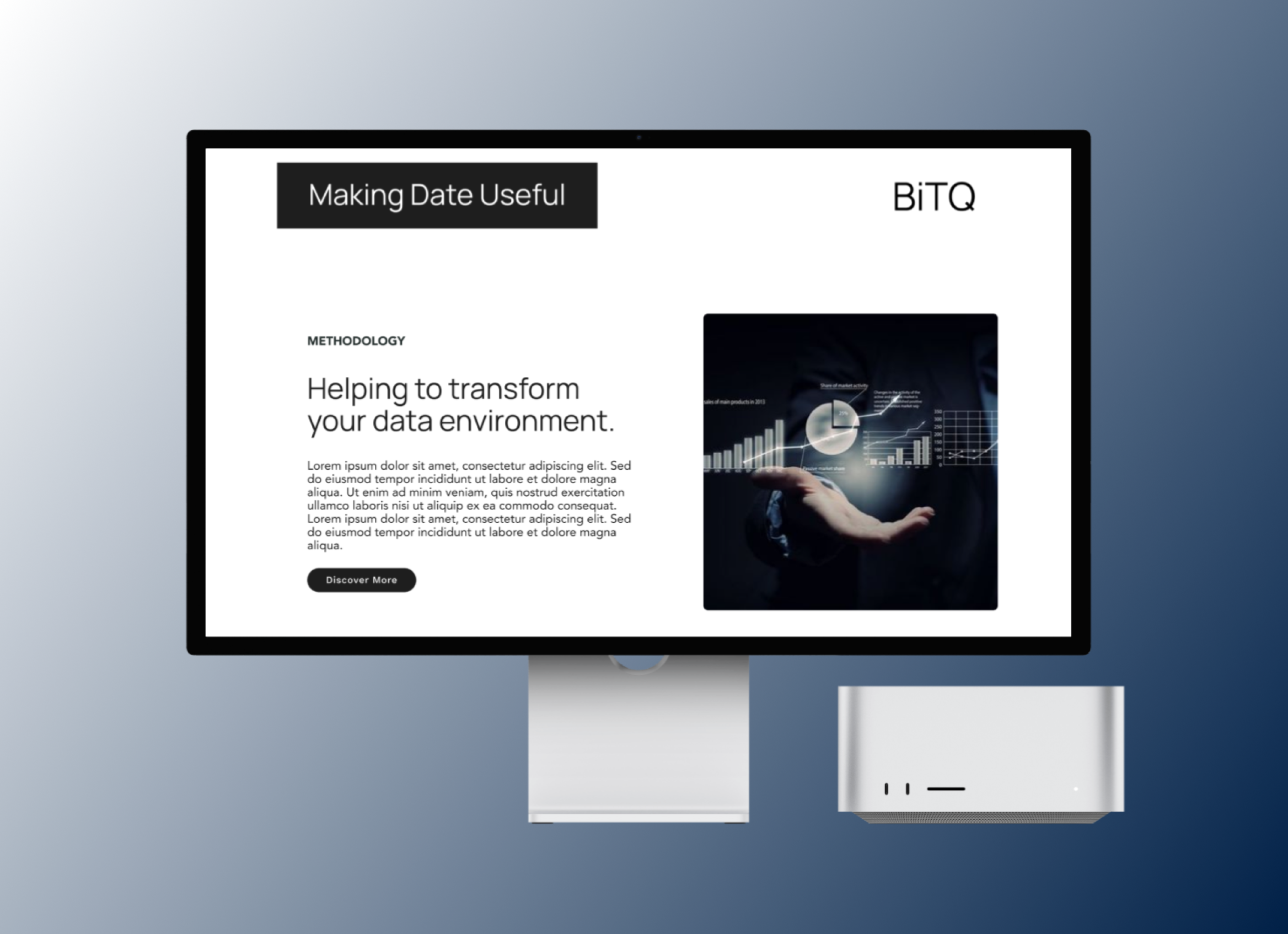
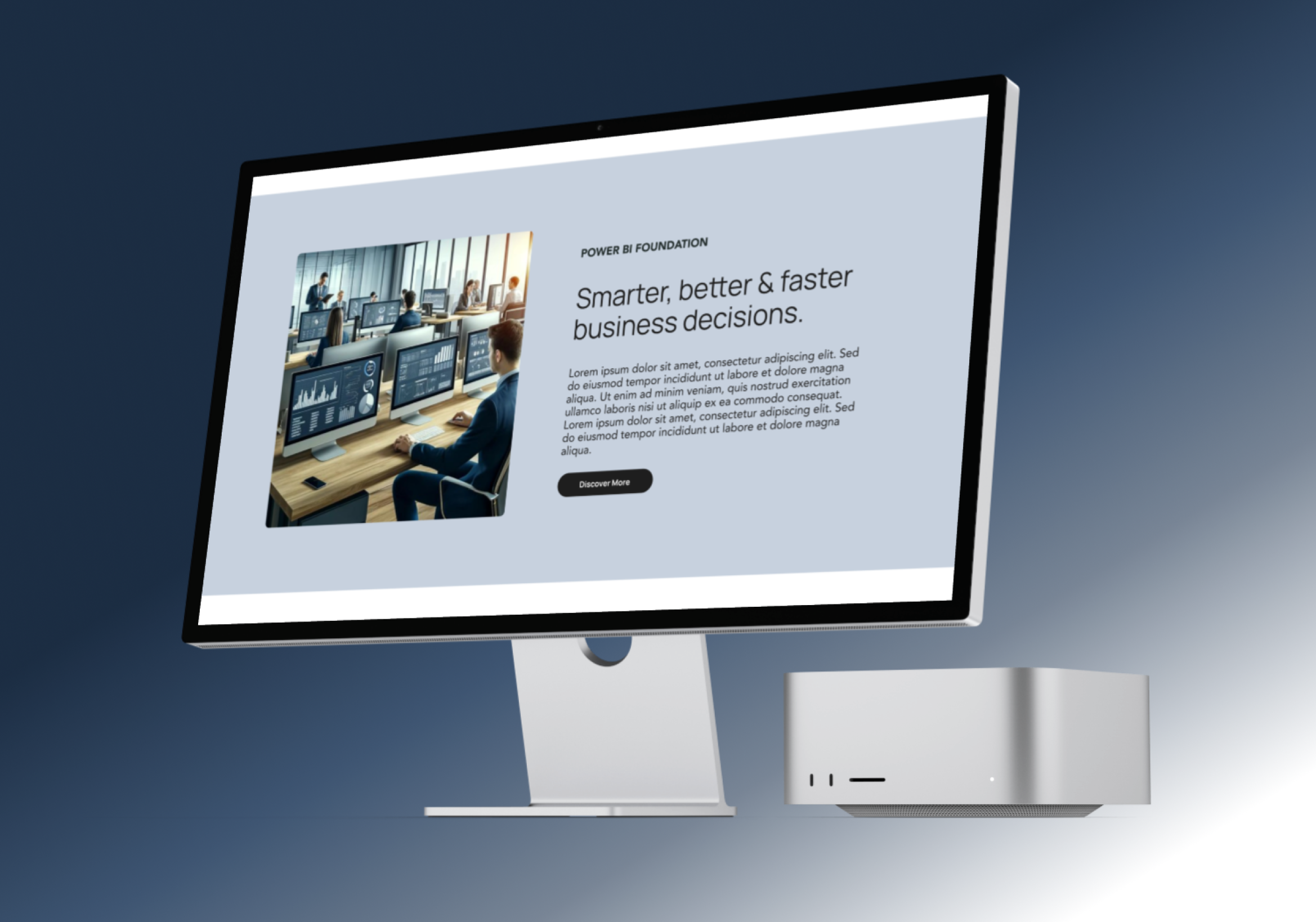
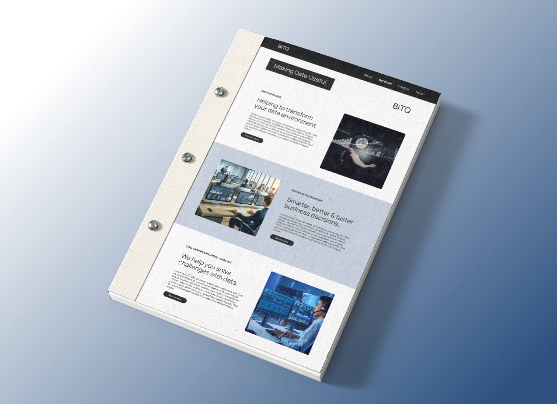
Professional aesthetic: Create a visually appealing website with a modern, tech-oriented design that reflects BiTQ's expertise and professionalism.

Clear communication: Ensure that the website effectively communicates BiTQ's services, values, and success stories to both existing and potential clients.

Optimal user experience: Prioritise user-centric design to enhance user satisfaction and engagement, leading to increased conversions and client retention.

Technical Requirement

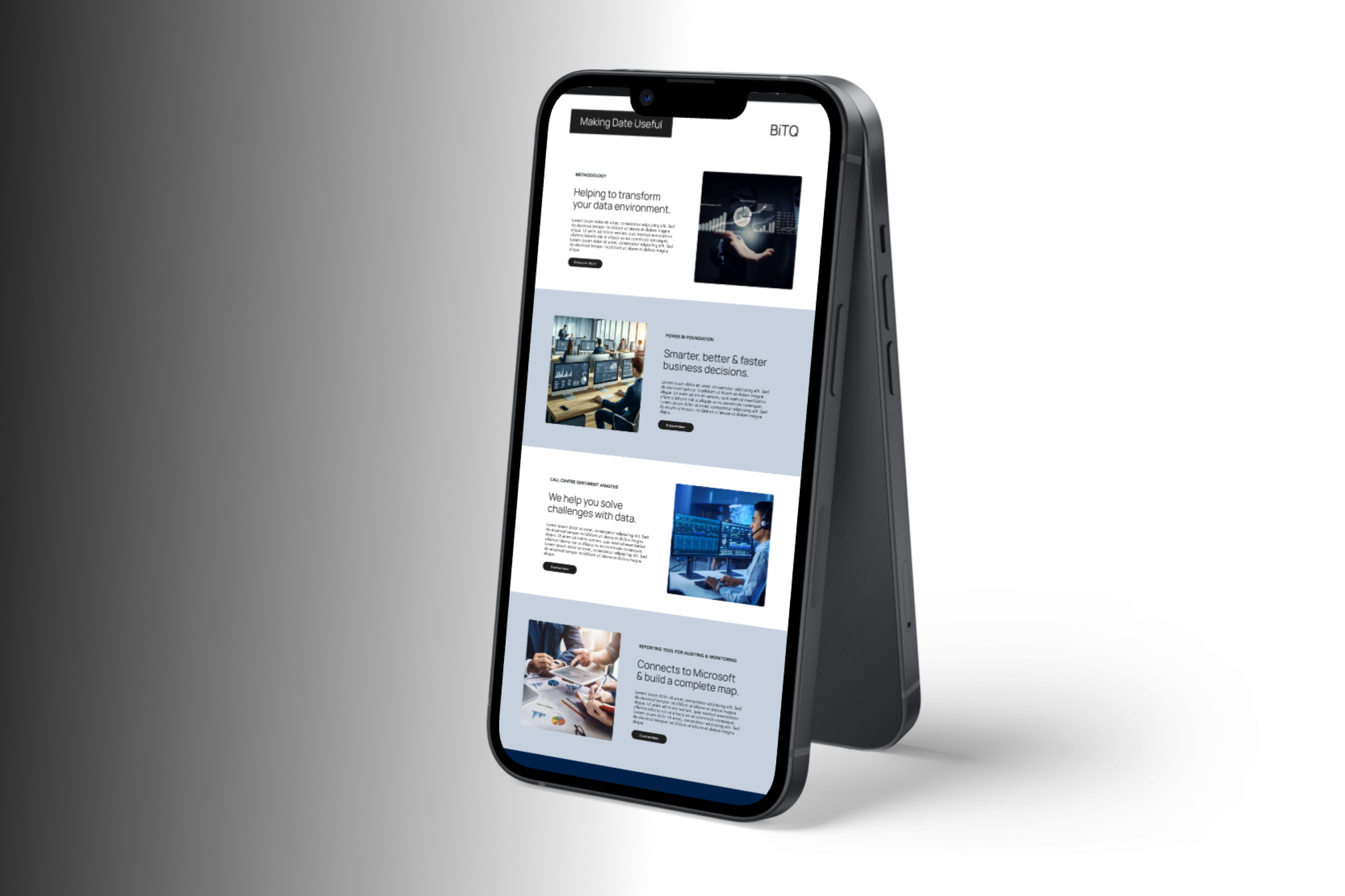
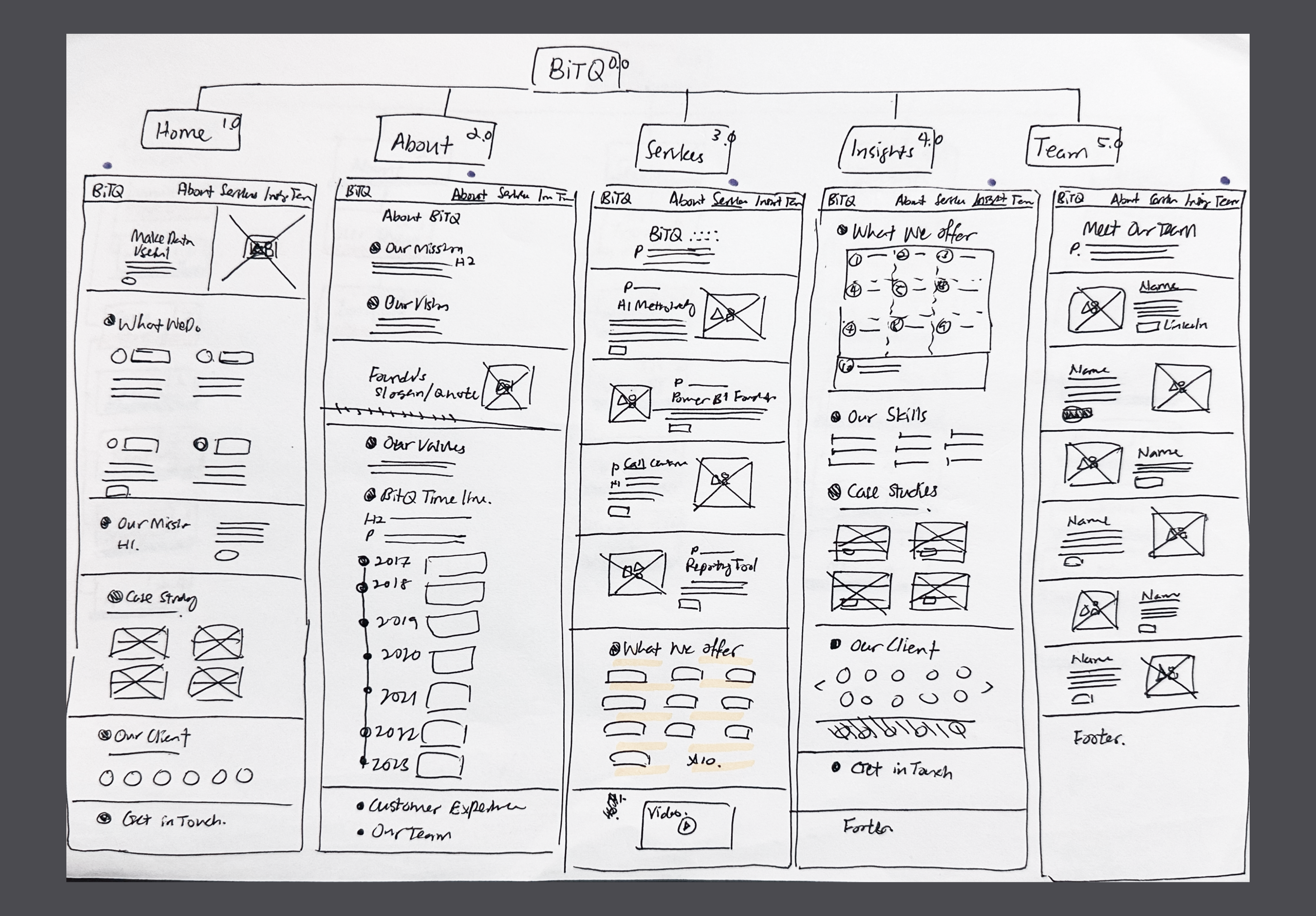
Responsive design: Develop a website that is fully responsive across various devices and screen sizes to provide a seamless user experience.

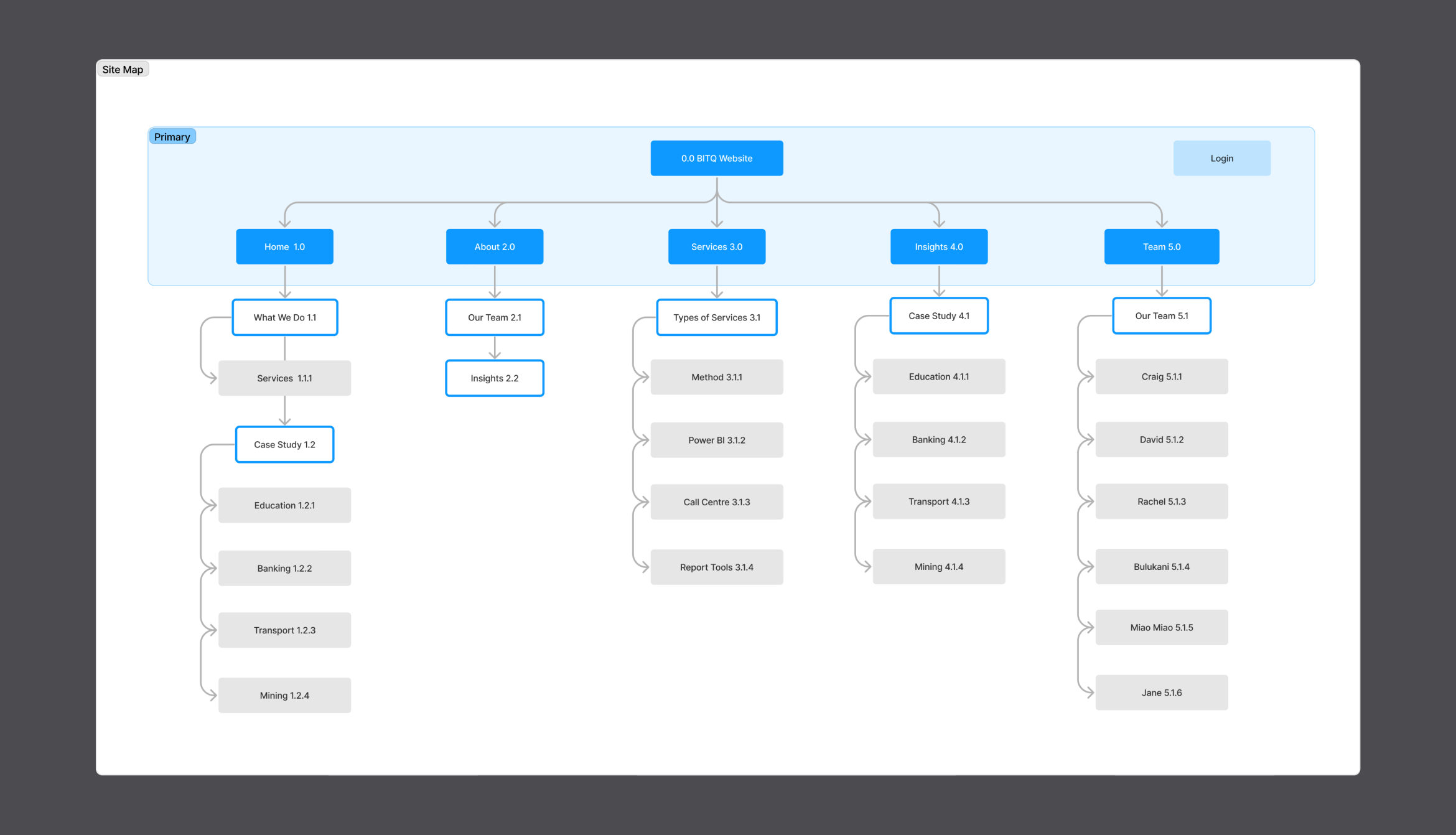
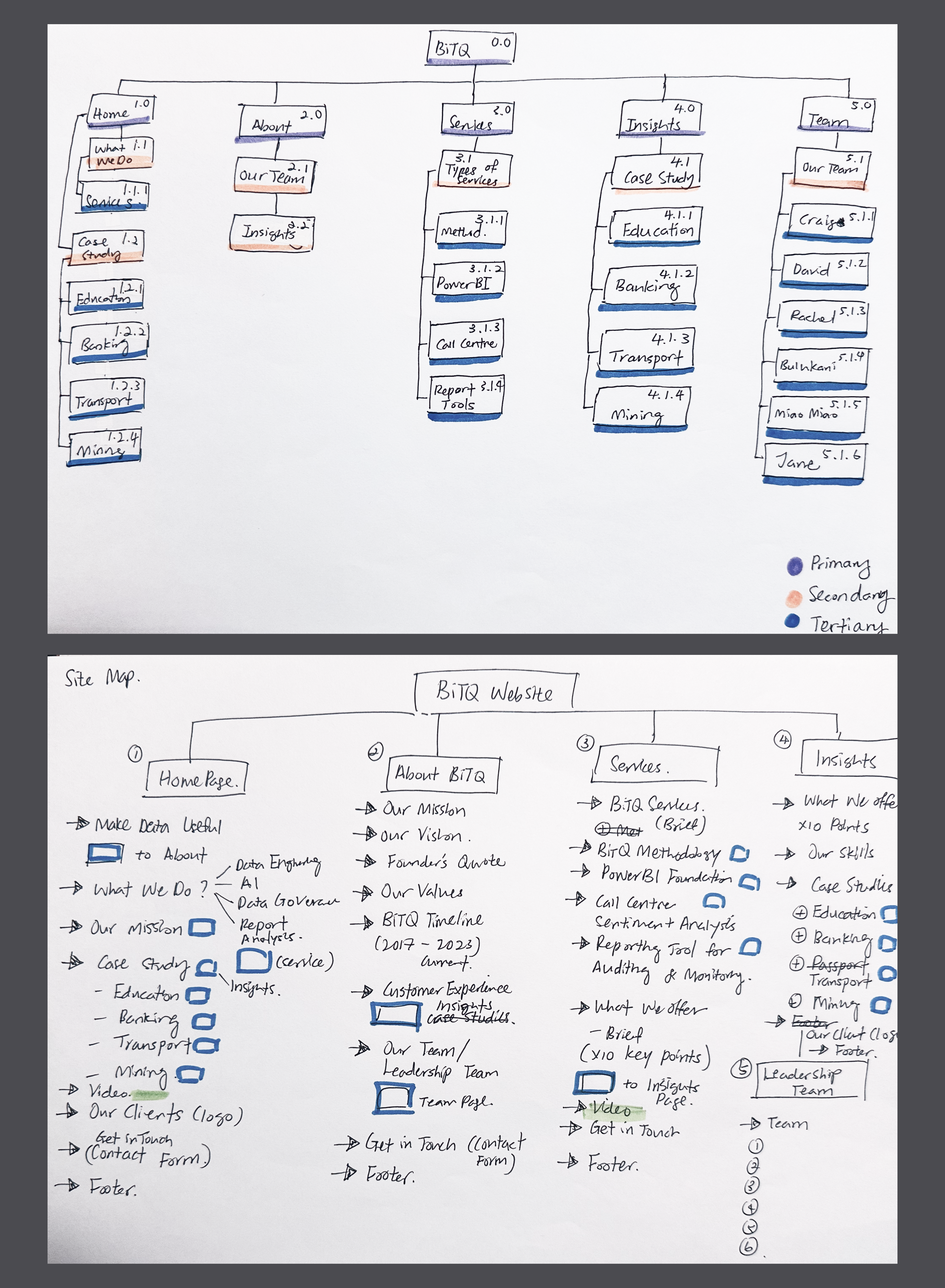
Intuitive navigation: Implement clear and intuitive navigation menus and site structure to facilitate easy exploration of content.

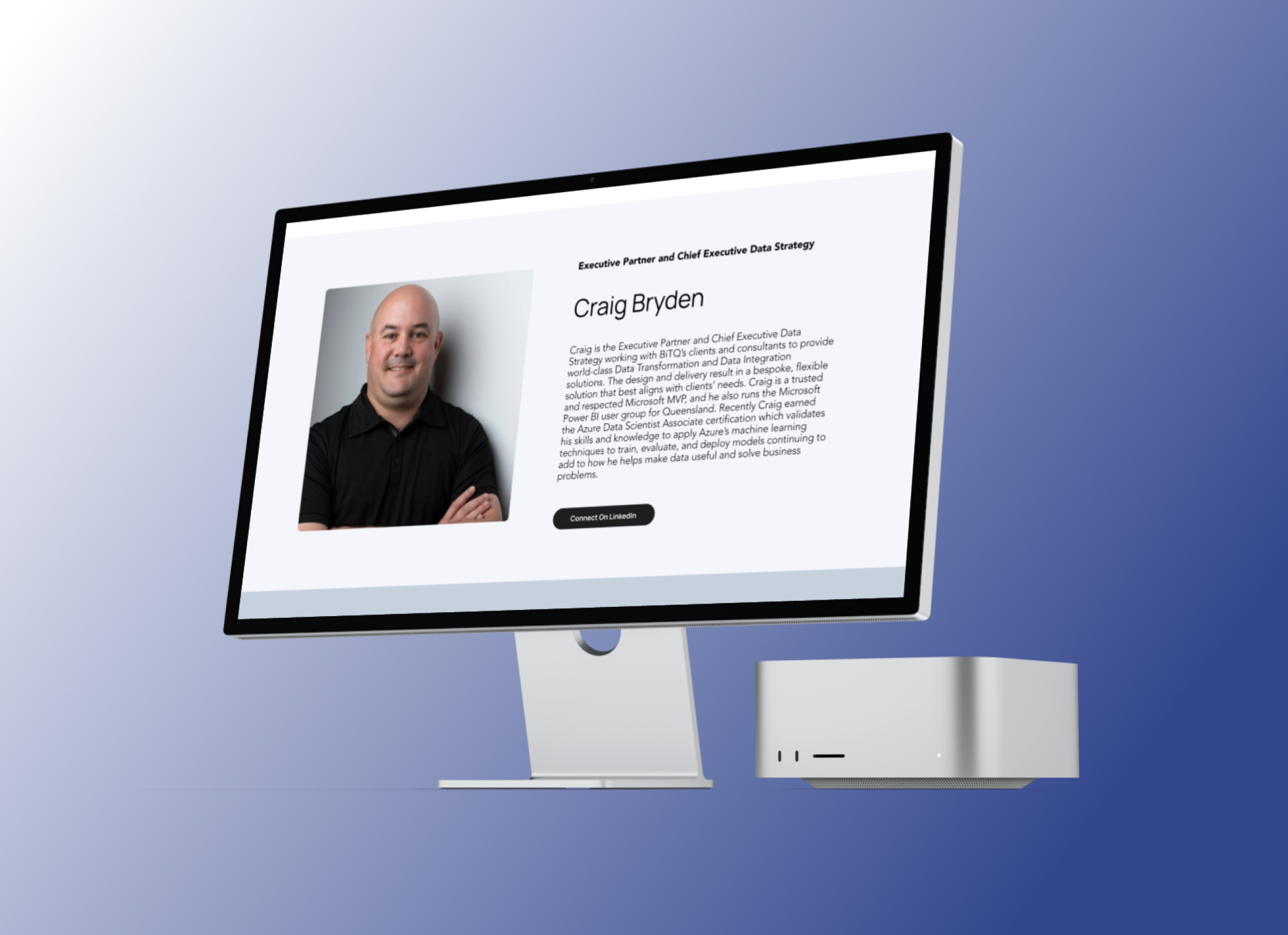
Showcase case studies: Create a dedicated section to showcase BiTQ's case studies, including detailed descriptions, visuals, and client testimonials.

Content management system (CMS): Utilise a CMS such as WordPress or Drupal to allow easy content updates and management by BiTQ's team.

SEO optimisation: Implement on-page SEO techniques to improve the website's visibility and ranking on search engines, increasing organic traffic.

Integration with analytics tools: Integrate Google Analytics or similar tools to track website traffic, user behaviour, and conversion metrics for continuous improvement.

Security measures: Implement robust security measures to protect user data and the website from potential threats, ensuring a safe browsing experience.

Performance optimisation: Optimise website performance by minimising page load times and ensuring smooth functionality across different browsers.

User Insight

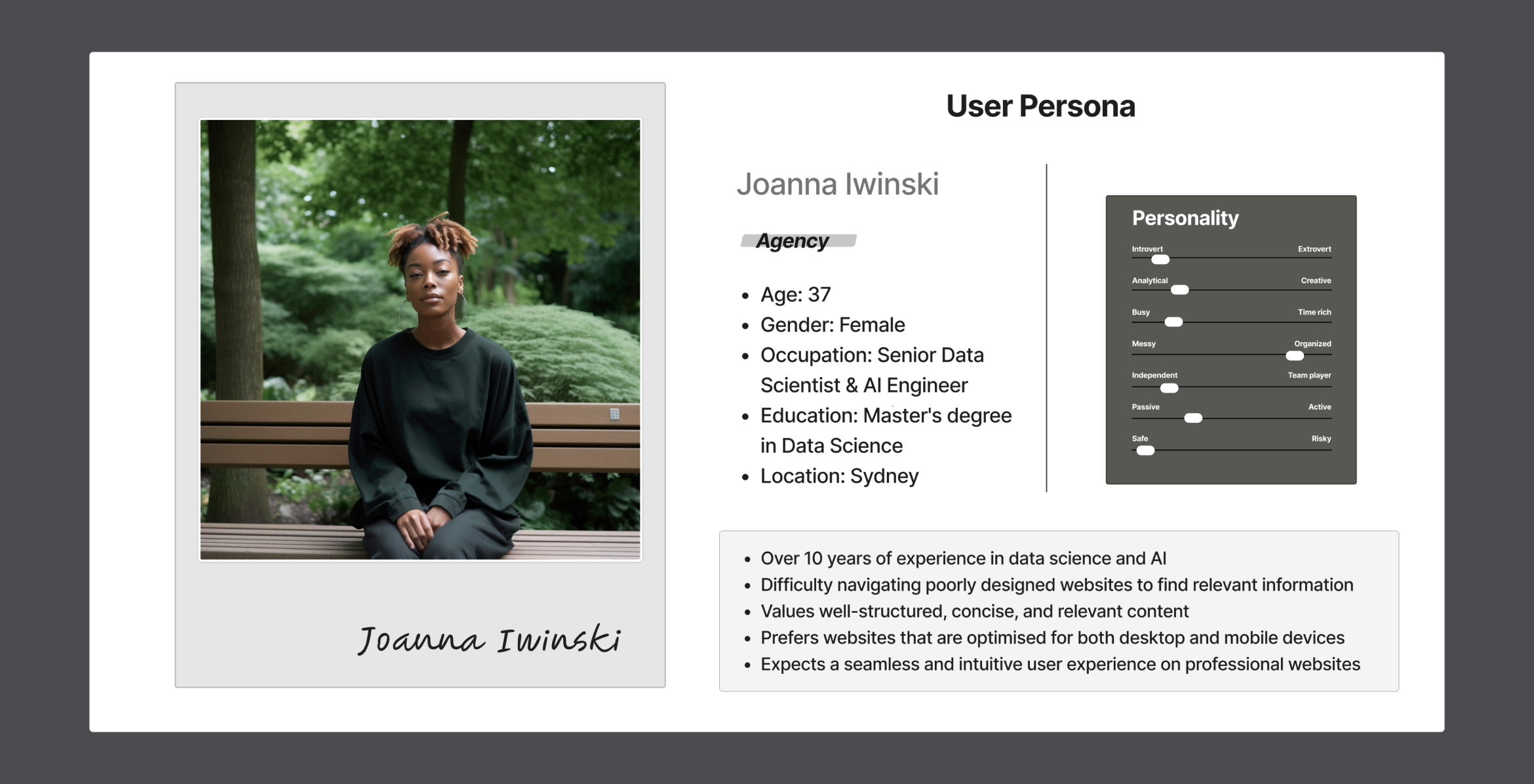
Given Joanna Iwinski's background as a Senior Data Scientist & AI Engineer, she expects a seamless online experience when seeking technology consultancy services. However, her frustrations arise from encountering websites with poor navigation and aesthetics, like BiTQ's current site, which fail to effectively communicate the company's expertise. Joanna values efficiency and precision, desiring a website that not only offers well-structured content but also aligns with her professional standards. She seeks a platform that showcases BiTQ's proficiency in data engineering and AI in a clear and compelling manner, enabling her to quickly assess the company's capabilities and suitability for potential projects.

Problem Statement

BiTQ, a technology consultancy based in Brisbane, faces challenges with its current website, which suffers from poor navigation and aesthetics, resulting in a failure to attract new clients and projects. The website does not effectively showcase BiTQ's expertise in data engineering and AI, hindering client acquisition and engagement.

How Might We

How might we redesign BiTQ's website to improve navigation and aesthetics while effectively showcasing its proficiency in data engineering and AI, ultimately attracting new clients and projects?

Bitq User Insights

Architecture

Revamping Navigation and Site Map

In the project to improve BiTQ's website, I focused on making the navigation and site map more user-friendly. I restructured the main navigation into five clear sections: Home, About, Services, Insight, and Team. This made it easier for users to find information quickly. Each section was organised logically to help users move through the site smoothly and find what they need without confusion.

Categorising Information

I categorised information into specific sections to keep everything clear and relevant. The 'Home' section was redesigned to show an overview of BiTQ's best work, focusing on case studies that highlight their expertise. The 'About' section explains BiTQ's mission, vision, and values, helping users understand who BiTQ is. The 'Services' section details the various services BiTQ offers, making it easy for potential clients to see what BiTQ can do for them. The 'Insight' section features industry insights and thought leadership to engage users with valuable content. The 'Team' section introduces the people behind BiTQ, showcasing their skills and building trust with users.

Implementing Accessibility Design Elements

To make the website accessible to everyone, I added several design elements. I chose colours and font sizes that are easy to read, even for users with visual impairments. Navigation menus were designed with clear labels and good contrast to make them easy to use. I also added visual cues throughout the site to guide users, improving the overall user experience.

Optimising the Homepage

I designed the homepage to focus on BiTQ's case studies, giving potential clients a clear idea of BiTQ's strengths. By highlighting these case studies, users can quickly understand what BiTQ does best. The content on the homepage was arranged logically, starting with the most important information at the top. This structured layout helps users follow a clear path and understand BiTQ's value easily. In summary, I improved BiTQ's website by creating a clear and easy-to-use information architecture, logically categorising information, adding accessibility features, and optimising the homepage to showcase BiTQ's expertise. This approach ensures users can navigate the site easily, find relevant information, and understand BiTQ's full range of services.

Bitq Architecture

Design Challenges

One of the most challenging aspects of the project was designing the site map and arranging content hierarchically and logically. It was crucial to consider the perspectives of users, the business, and stakeholders to create a design that meets everyone's needs. I focused on extracting the most valuable core of BiTQ and ensuring that the message was clearly delivered to users and buyers.

To achieve this, I made sure that information was not overwhelming and that content was well-organised in a user-friendly design. I prioritised showcasing who BiTQ is and what they do best, heavily featuring their case studies. This approach aimed to provide solid assurance to users and buyers about BiTQ's successful projects, helping to build a reputation and trust in the industry through the revamped website.

By balancing clarity, organisation, and engagement, I ensured that the revamped website effectively communicated BiTQ's expertise and strengths, ultimately supporting their business goals and enhancing user experience.

Bitq Design Challenges

Lo-Fi Wireframes

Click here to browse project notes

During the initial phase of revamping BiTQ's website, I encountered challenges in designing the site map and organising content logically. This required balancing perspectives from users, the business, and stakeholders to achieve a cohesive design. Using low-fidelity (Lo-fi) designs, I mapped out the site's structure and navigation, focusing on simplicity and clarity. The goal was to highlight BiTQ's core strengths and achievements through case studies, aiming to build trust with potential clients. I also improved the design and colour scheme of the 'Team' section to emphasise BiTQ's expertise and professionalism.

User Testing & Feedback

Some users mentioned they would benefit from more detailed explanations or tooltips in certain sections to understand BiTQ's services better.

Users suggested enhancing the 'Team' section with more detailed profiles or direct links to individual team members for easier access.

There was feedback about ensuring important information is more prominently displayed to prevent it from feeling buried within menus or subpages.

Suggestions were made to adjust the colour contrast on text elements to improve readability, particularly for users with visual impairments.

Through our user interviews, it was evident that highlighting BiTQ's expertise in Data Engineering and Artificial Intelligence at the forefront of the website would significantly increase user engagement and interest.

Bitq Lo-Fi Wireframes 1 Bitq Lo-Fi Wireframes 2

Design Iteration

Iteration Notes: Insight Page

During the design iteration of the Insight page, I initially placed the "What We Offer" section at the hero section of the website. However, through user testing and feedback analysis, it became evident that the core of BiTQ's business lies in Data Engineering and Artificial Intelligence. These areas are not only central to BiTQ's services but are also current hot topics in the industry.

Leveraging design thinking principles, I decided to reposition the focus to highlight these key areas prominently. This decision was based on the understanding that showcasing BiTQ's expertise in these trending fields would not only attract more user attention but also improve the conversion rate. By aligning the design with user expectations and industry trends, we can effectively communicate BiTQ's value proposition and professional tech services, thereby enhancing user engagement and driving business growth. This iterative approach ensured that the final design was both user-centric and aligned with BiTQ's strategic goals.

Bitq Design Iteration

New Design System

Primary and Secondary Colour Palette Selection

As a UX/UI designer, I meticulously selected the primary and secondary colour palettes for BiTQ to maintain the original essence of their black and gold branding while incorporating complementary cool tones for a more harmonious and accessible design. The primary colours chosen were #8B6E00 (gold), #D3D6DD (pale grey), and #1E1E1E (black). To balance these bold colours, I introduced secondary colours: #F4F7FC (pale grey), #A2A6AF (mid grey), #242E2D (dark grey), #3E5572 (navy blue), and #002047 (deep blue).

Design Thinking and Visual Balance

High-quality and professional images related to Elite Property Law are incorporated, complementing the deep blue and grey colour palette. Images are optimised for fast loading times without compromising quality, ensuring a smooth user experience.

Accessibility Considerations

Accessibility was a paramount consideration in my design process. I ensured that all colour choices provided high contrast, passing accessibility tests to enhance readability for all users, including those with visual impairments. This decision supports inclusive design practices, ensuring that BiTQ's website is usable by a diverse audience.

Enhancing Brand Identity

Additionally, the colour palette was selected to create a cohesive visual identity that communicates professionalism and trustworthiness, which are key attributes for BiTQ's brand. By balancing the strong, original colours with softer, cooler tones, I aimed to evoke a sense of reliability and expertise, helping to build user confidence in BiTQ’s offerings. This strategic use of colour supports the overall user experience by making the website both aesthetically pleasing and functional.

Bitq New Design System

Typography & Cards

Typography

I used Manrope and Avenir as the main fonts for BiTQ. These clean and easy-to-read fonts help users avoid feeling overwhelmed by the content and focus on the information without distractions. Their modern and simple design makes reading easier and improves the overall user experience.

Buttons

The buttons have simple rounded corners, with white text on a black background. This strong contrast makes the buttons stand out against the lighter background, drawing users' attention. This design encourages users to click the buttons to learn more, improving interactivity and engagement on the website.

Card Design

The cards are designed to organise information clearly, so users can quickly see the most important details first. This layout helps users find what they need at a glance and makes navigating the site easier. The organised structure of the cards creates a user-friendly interface.

Bitq Typography & Cards

Final UI Design

Bitq Final UI Design 1 Bitq Final UI Design 2

Hi-Fi Prototype

Click the photo to navigate to BITQ's Hi-Fi Prototype.

Bitq Hi-Fi Prototype

Project Takeaway and Learning

This project highlighted the importance of aligning website design with core business strengths and current industry trends. By focusing on user-centred design principles, we successfully transformed BiTQ's website into a platform that showcases their expertise in Data Engineering and Artificial Intelligence while enhancing user engagement and client acquisition. The iterative design process, coupled with ongoing user feedback, showed that a clear emphasis on usability and aesthetics significantly improves the overall user experience.

Incorporating animations and 3D elements could have made the website even more impactful and helped BiTQ stand out among competitors. Due to time and budget limitations, we were unable to include these features. However, enhancing the design with such elements in the future would further increase the site's appeal. This project reinforced the value of thorough research, strategic content placement, and responsive design in creating a successful digital presence. It also emphasised the necessity of adaptability and continuous learning in the ever-evolving field of UX/UI design.

External Links

Link to project notes: https://www.figma.com/board/cKXTVRIllajyHbDiRsN7O3/BitQ-Website-Redesign-Project?node-id=0-1&t=u3JJhmKTBHffTQIi-1

Link to Lo-Fi Prototype: https://www.figma.com/proto/HJtRQPYT4uwhMY7KPN15pN/BitQ-Website-Evaluation?page-id=90%3A13419&node-id=132-5219&viewport=606%2C93%2C0.06&t=BmJiKv9eYokmSN2S-1&scaling=scale-down&content-scaling=fixed&starting-point-node-id=132%3A5219&show-proto-sidebar=1

Link to Hi-Fi Prototype: https://www.figma.com/proto/HJtRQPYT4uwhMY7KPN15pN/BitQ-Website-Evaluation?page-id=90%3A13419&node-id=90-15028&viewport=606%2C93%2C0.06&t=BmJiKv9eYokmSN2S-1&scaling=scale-down&content-scaling=fixed&starting-point-node-id=90%3A15028&show-proto-sidebar=1

Link to existing website: https://www.bitq.com.au/