ABC News

The redesign project for ABC News focuses on enhancing the platform's navigation system to amplify its reputation for delivering accurate and comprehensive news. With an emphasis on improving user experience through intuitive navigation, the goal is to ensure easy access to diverse content types like articles, videos, and multimedia.

Crafting a compelling digital narrative through the redesigned navigation aims to boost reader engagement and user interaction. Recognizing the significance of seamless navigation in fostering an active online community, we strive to create an experience that facilitates effortless exploration and connection with the content.

Challenges

The challenge lies in simplifying and streamlining the navigation system of the ABC News website to ensure it is user-friendly and easy to navigate. This involves reorganising and categorising content effectively while maintaining clarity and coherence. The goal is to enhance the user experience and make accessing news and information effortless for all visitors.

ABC News Challenges

Solution

To make it easier to find news on the ABC News website, we will add a second menu with more options when you click on it. Also, we will make the website look nicer and work better on all devices, like phones and computers. This will help people find what they need faster and enjoy reading the news more.

ABC News Solution

Approach

As a first step, we checked how people use ABC News website and what parts they struggle with. We also looked at website data to see which pages are popular and how users move around. This helped us plan how to make the website easier to use. We used what we learned to create a new menu and design system that fits better with what users need. Our goal is to make ABC News website more user-friendly based on feedback and data.

ABC News Approach

Interview Findings

5 people were interviewed and observed browsing the existing ABC News website and 80% of completion rate for the usability testing.

Users want an easy way to choose specific activities from the main menu.

The [Listen] page needs better organisation and less cluttered icons for better user experience.

Lifestyle blogs and podcasts need clearer visual layouts for better understanding.

Users need clearer menu options to discover all available activities on the ABC News website.

Website Analysis

After analysing the website and conducting user testing, a notable issue became apparent: the primary navigation on ABC News webpages lacked clarity. Users found it confusing because there was no secondary drop-down menu to give more details about each topic. This meant users had to rely solely on the main navigation to understand the topics, making it harder to find what they were looking for.

ABC News Website Analysis

Feature Prioritisation Matrix

Navigation menu

Users find the menu bar with one word confusing and want more details for each topic.

A secondary drop-down menu would be helpful to explore each topic.

Users are unsure about the purpose of the "LOCAL" section.

Users find it confusing that "SPORTS" is under "NEWS" and want an easier way to navigate back to the news section.

Users have trouble returning to the ABC News homepage on mobile.

Content topics

Users want AI and Tech topics to be included in the lifestyle articles and blogs.

Users suggest making Technology a primary topic instead of Science.

Users prefer a desire to explore further for each topic in the primary menu bar.

Users are interested in AI and Tech being a major topic in the news.

User experience

Users want a more personalised navigation menu.

Users find the menu bar font size too small and suggest increasing it for better accessibility.

Users prefer higher quality content and better personalisation, such as podcasts.

Visual design

Users want more lifestyle and human-centred visuals to explore other topics and activities.

Users suggest including Art and Design in the "Everyday" sub-category.

Users find the lack of lifestyle and human-centred visuals confusing.

Personalisation

Users want the menu bar to be more personalised to their interests.

ABC News Feature Prioritisation Matrix

User Persona

Introducing Eveline Nguyễn, a 35-year-old marketing manager in a tech firm, residing in a vibrant urban area. With a master's degree in marketing, she leads a dynamic lifestyle and keeps abreast of current affairs. Trustworthy news sources are essential to her, given her tech-savvy nature and reliance on digital platforms for accessing information.

ABC News User Persona

Goals & Features

Goals

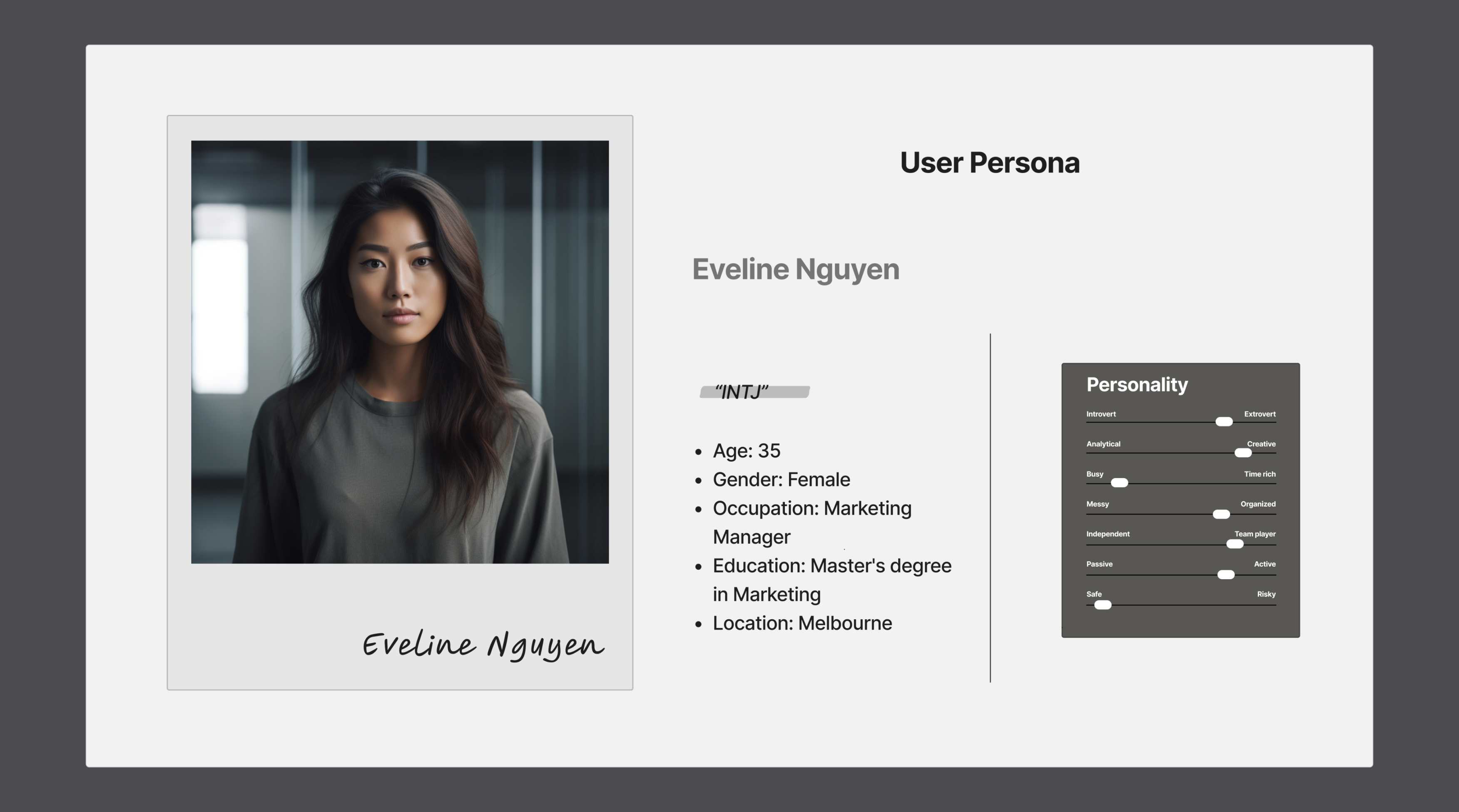
Time Saving: Eveline's busy schedule limits the time she can dedicate to consuming news. She seeks news platforms that offer concise and easily digestible news summaries or provide options for customised content delivery.

Influences

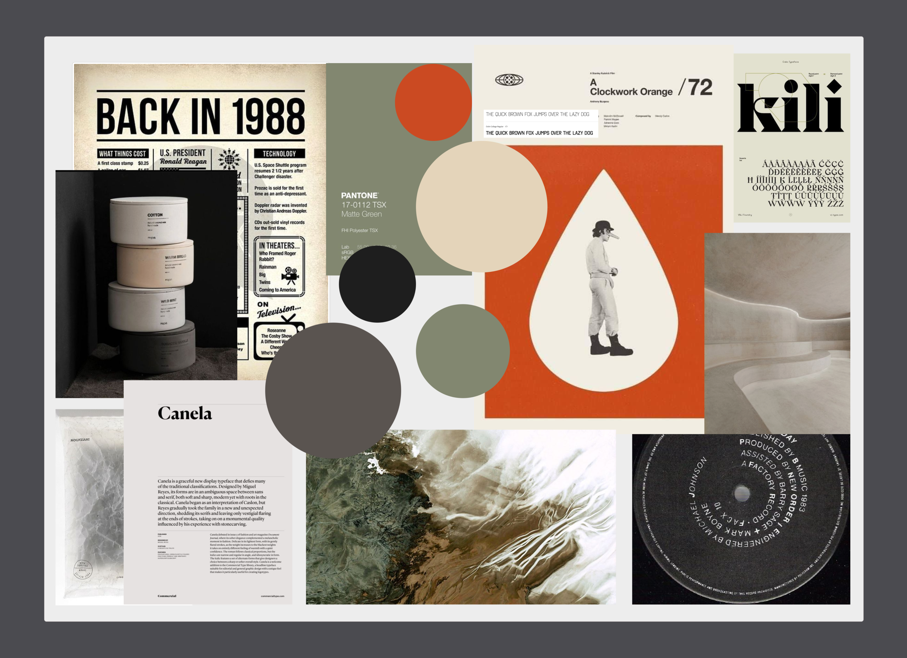
Visual Appeal: Eveline is drawn to visually appealing news content. She appreciates clean and modern designs, well-organised layouts, and engaging multimedia elements that enhance the storytelling experience.

Interest

Staying Informed: Eveline is an avid consumer of news and values being well-informed about local and global events, politics, technology, and business trends. She wants to stay up to date with accurate, reliable, and unbiased news.

Pain Points

Information Overload: With the abundance of news sources available, Eveline can feel overwhelmed by the sheer volume of information. She seeks a news platform that can help filter and curate relevant and reliable news content.

Needs & Expectations

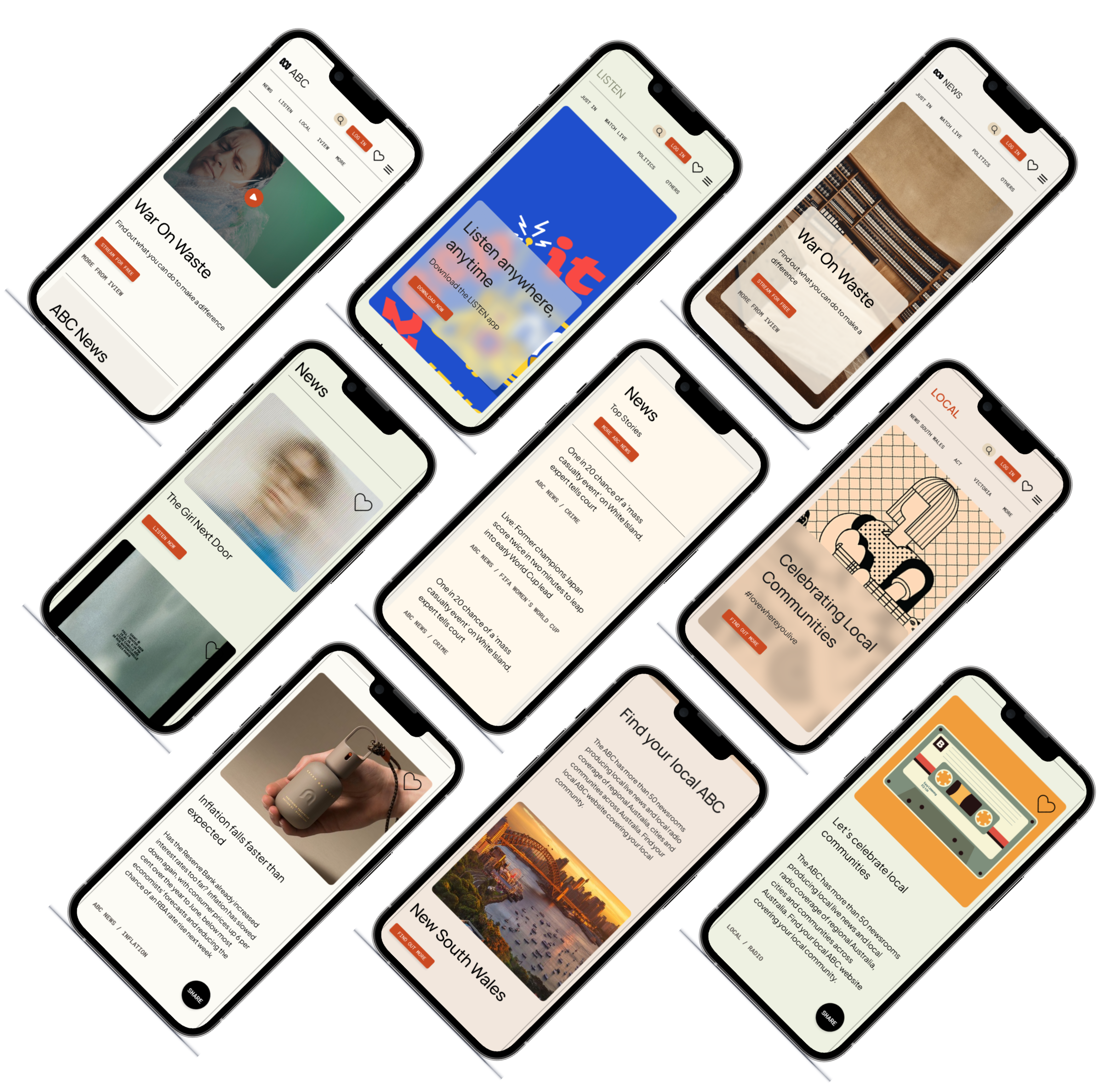
Convenience: Eveline leads a busy life and prefers news sources that provide convenient access to news content anytime and anywhere. She appreciates mobile apps and responsive websites that allow her to consume news on the go.

Architecture

To develop the physical product, I initially identified business aims and essential user requirements, which served as the foundation for crafting a primary architectural strategy. This strategy was devised through the formulation of "How Might We" statements, enabling us to address user needs effectively while also considering the feasibility of technological implementations and task mappings.

How might we?

How might we deliver concise and easily digestible news summaries to Eveline, allowing her to stay informed despite her busy schedule?

How might we incorporate visually appealing design elements and multimedia features into our news platform to attract Eveline's attention and enhance her storytelling experience?

How might we develop a news filtering and curation system that helps Eveline manage information overload, providing her with relevant and reliable news content tailored to her interests and preferences?
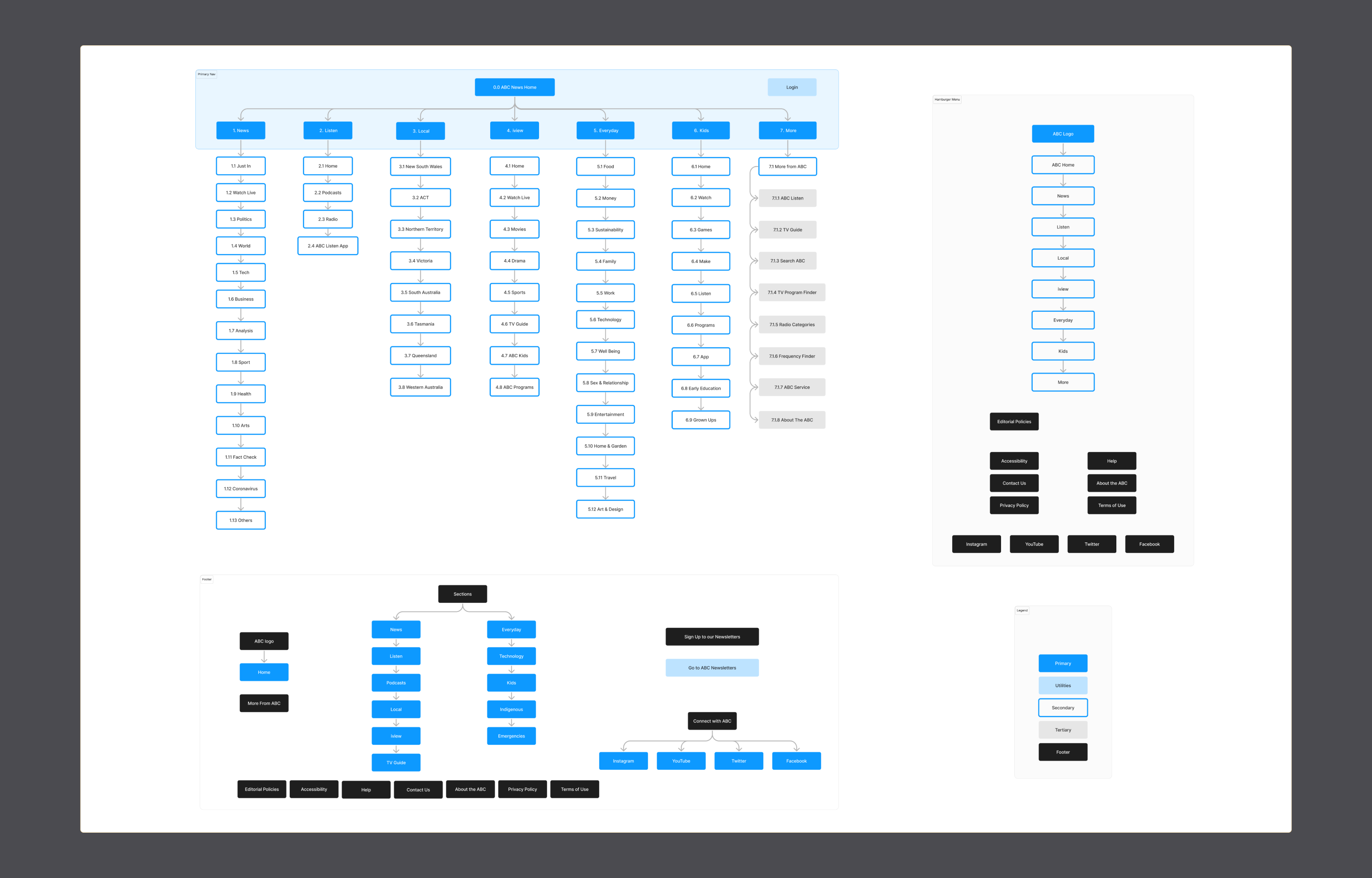
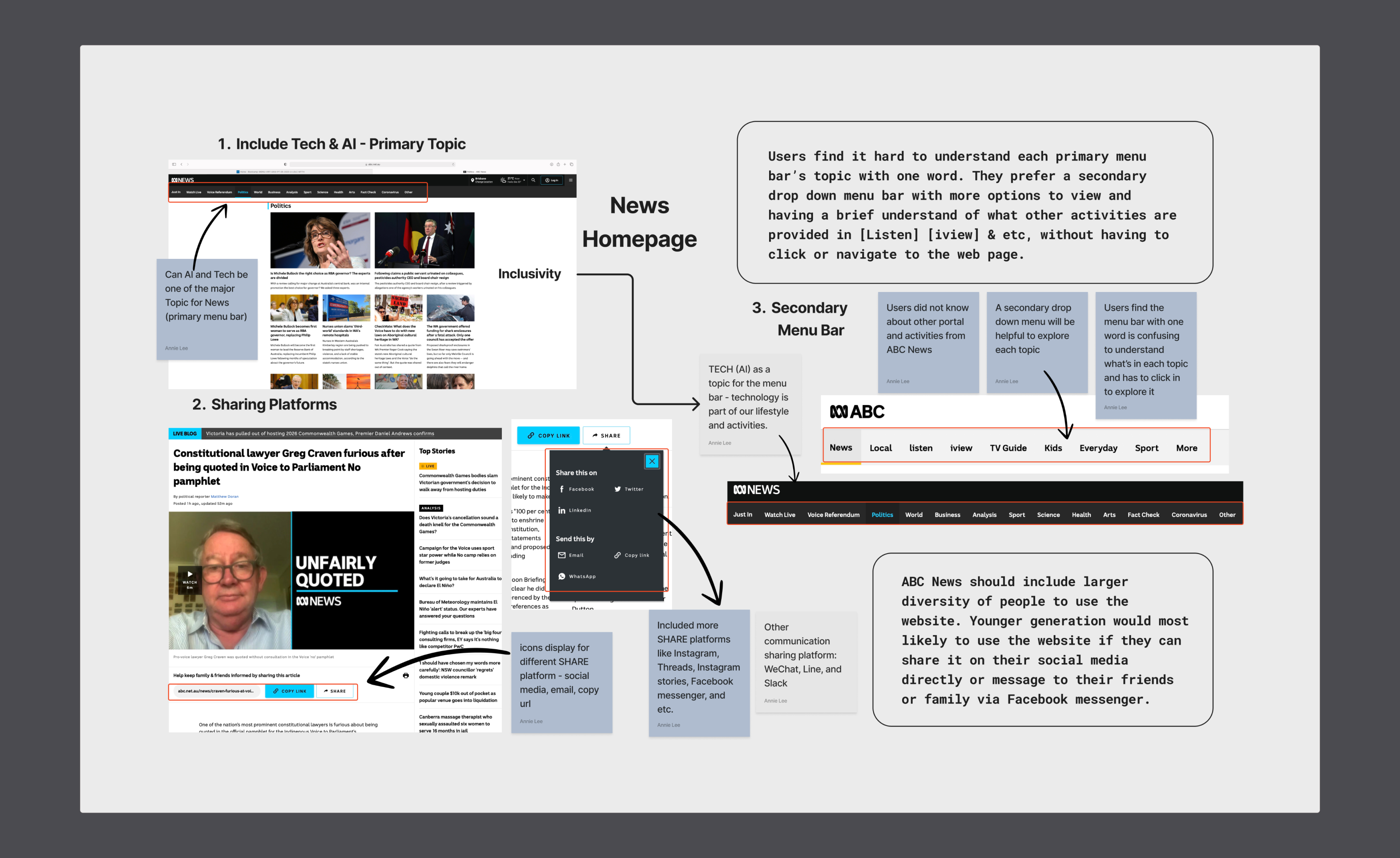
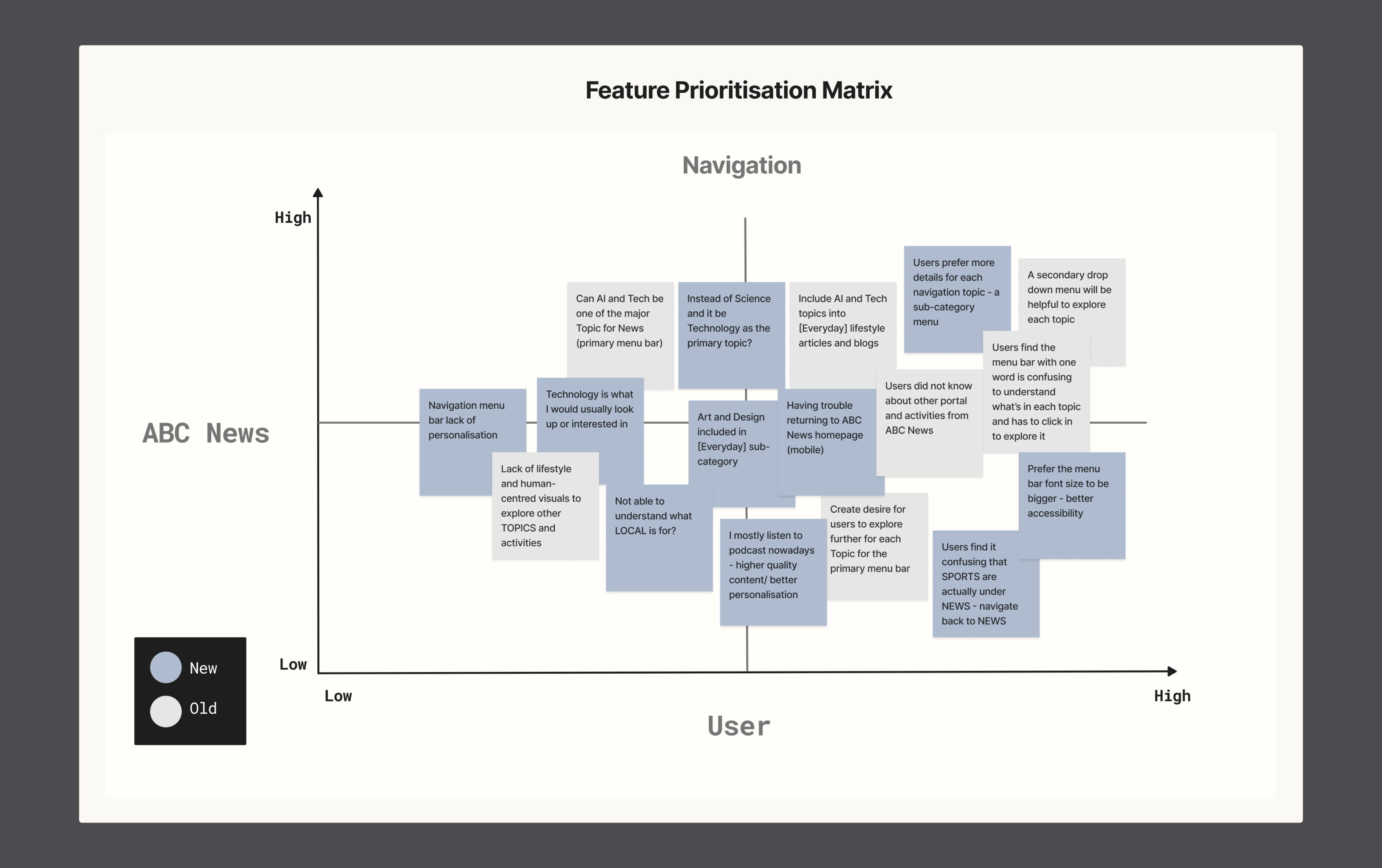
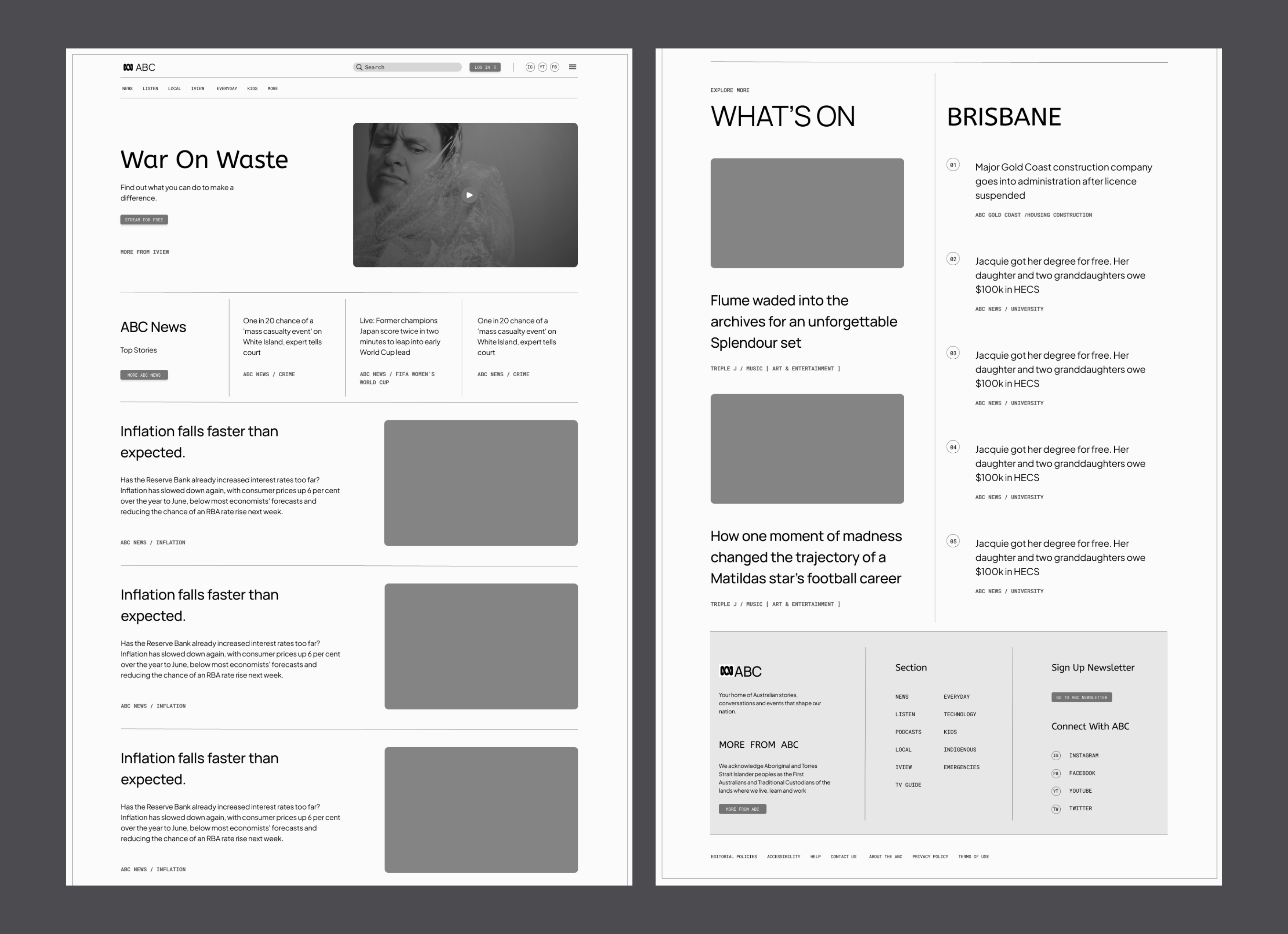
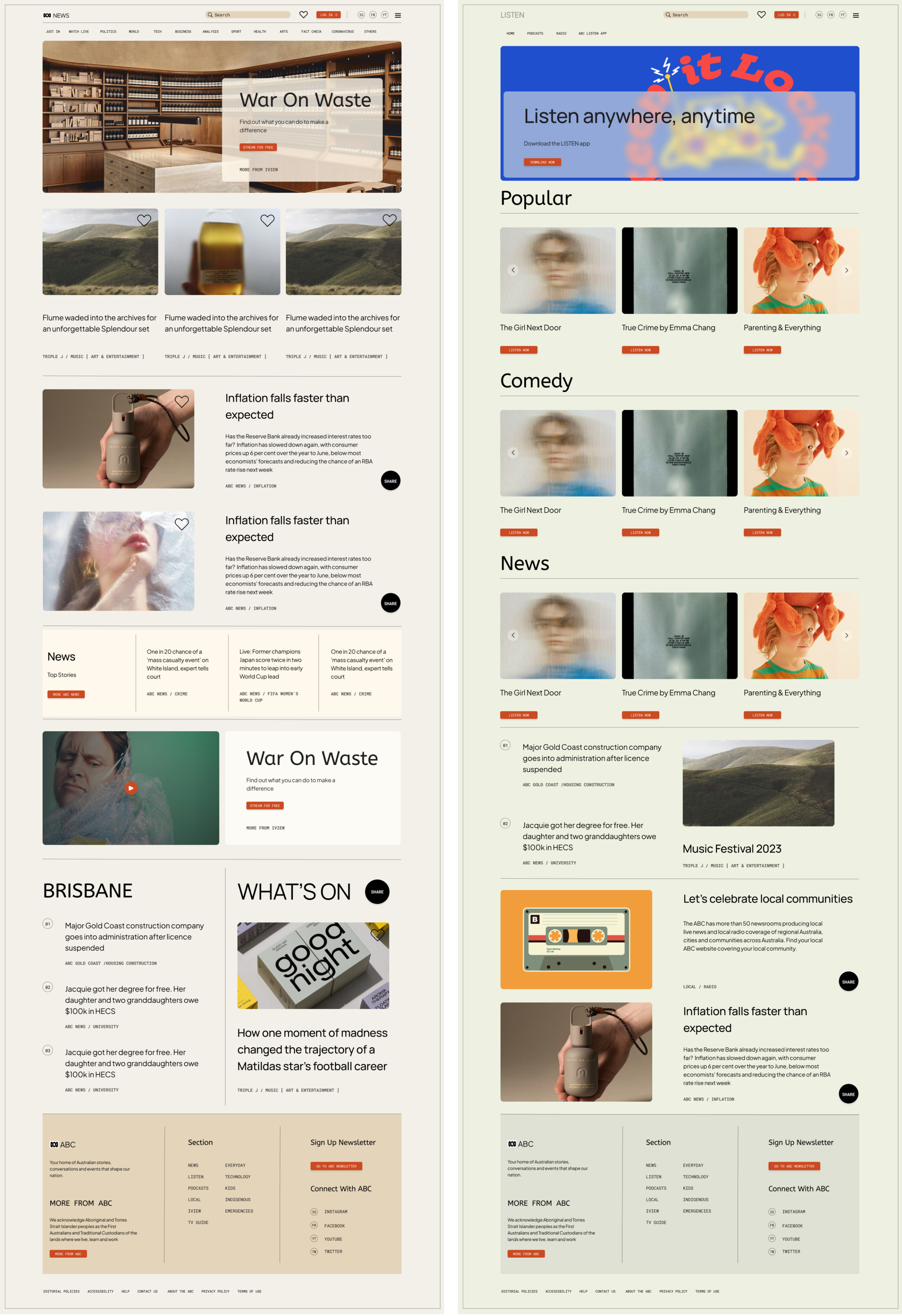
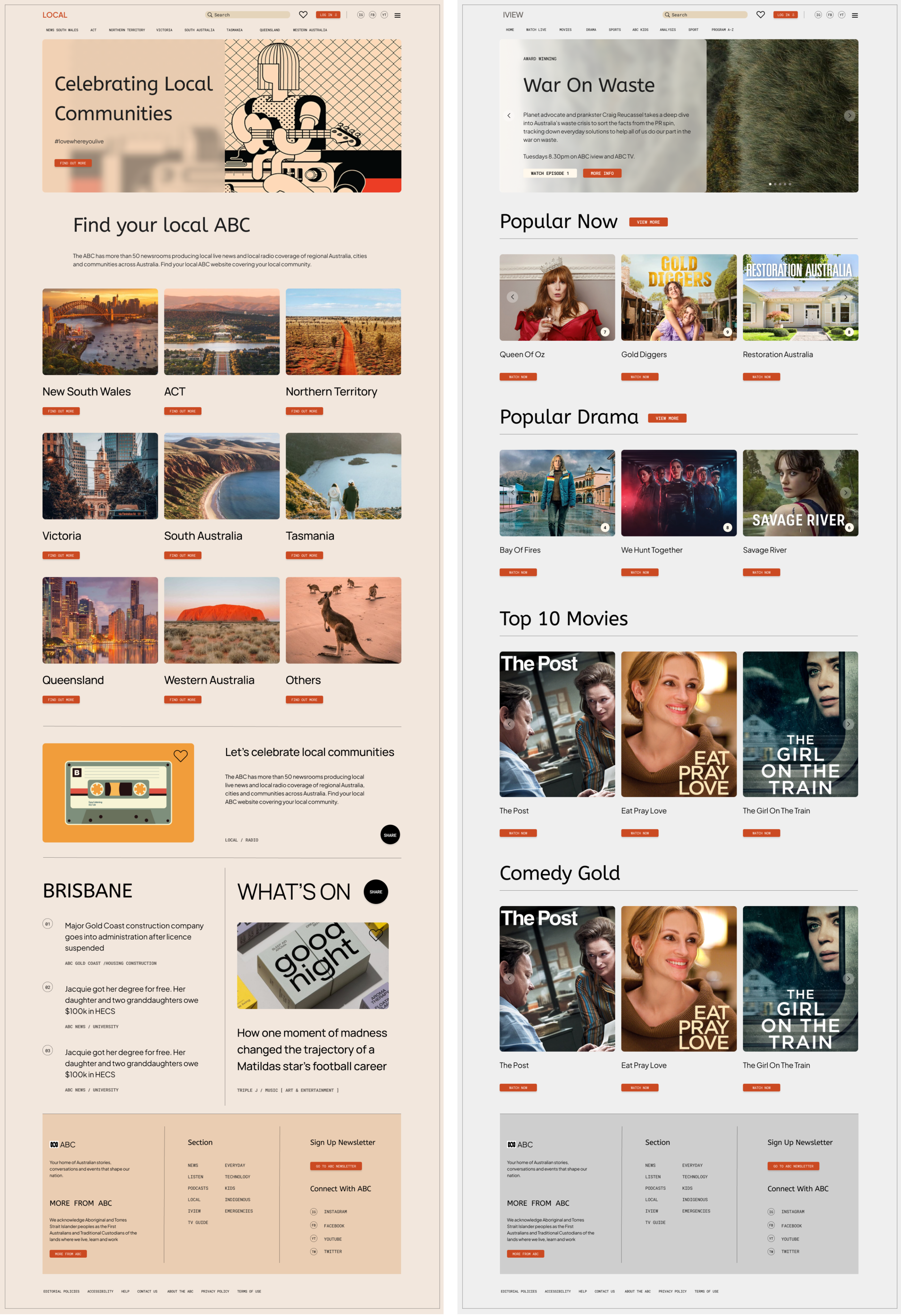
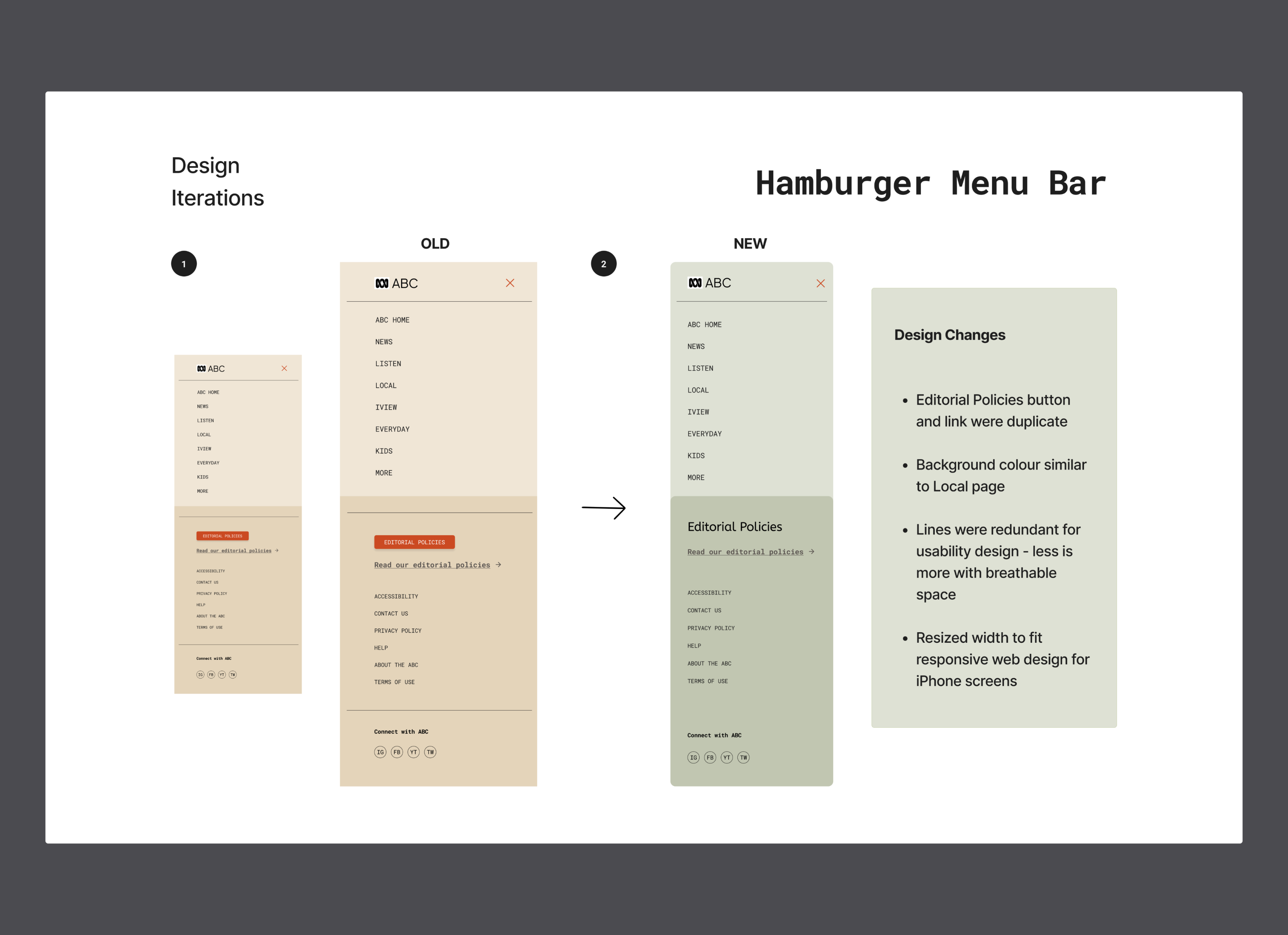
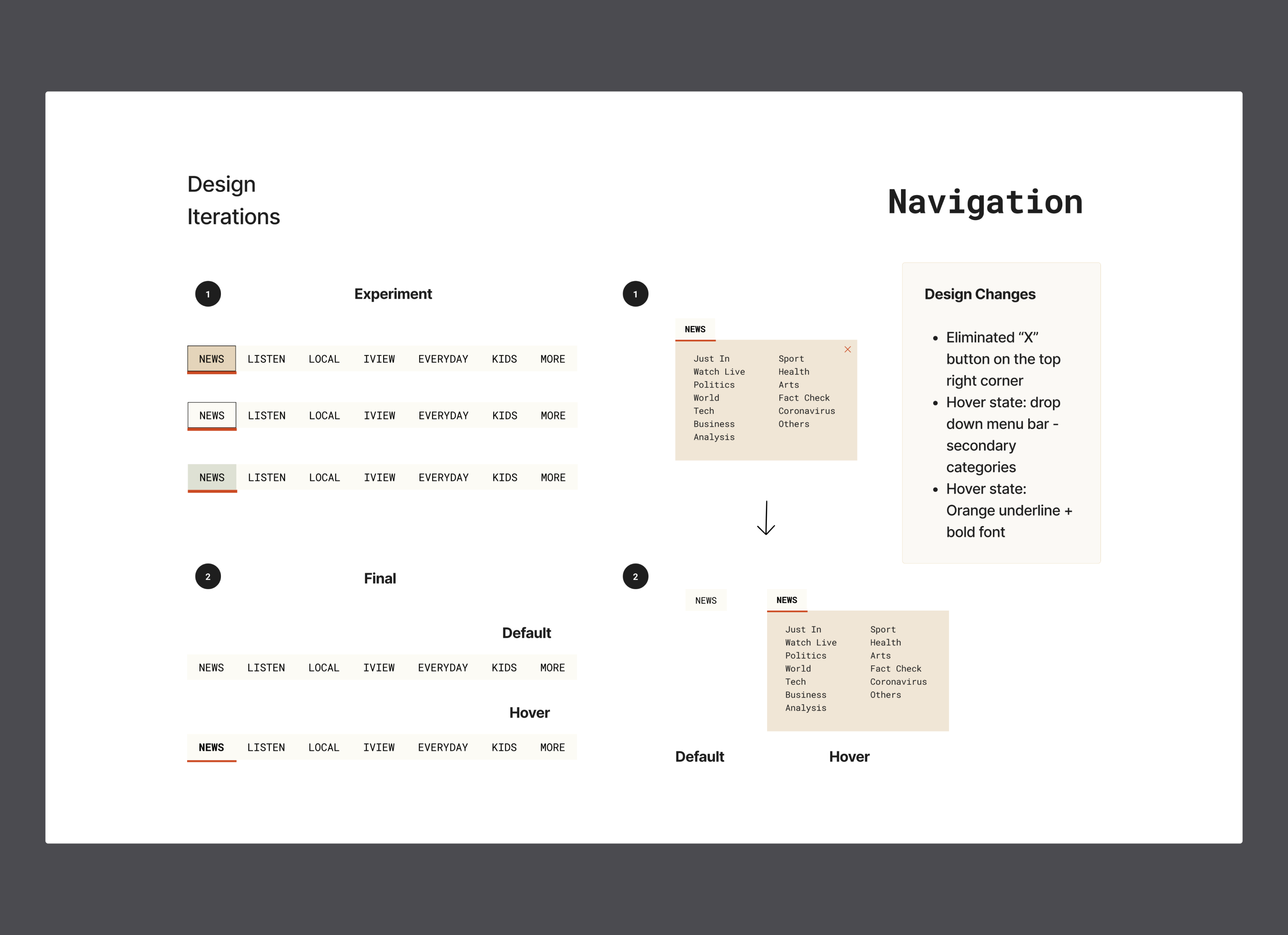
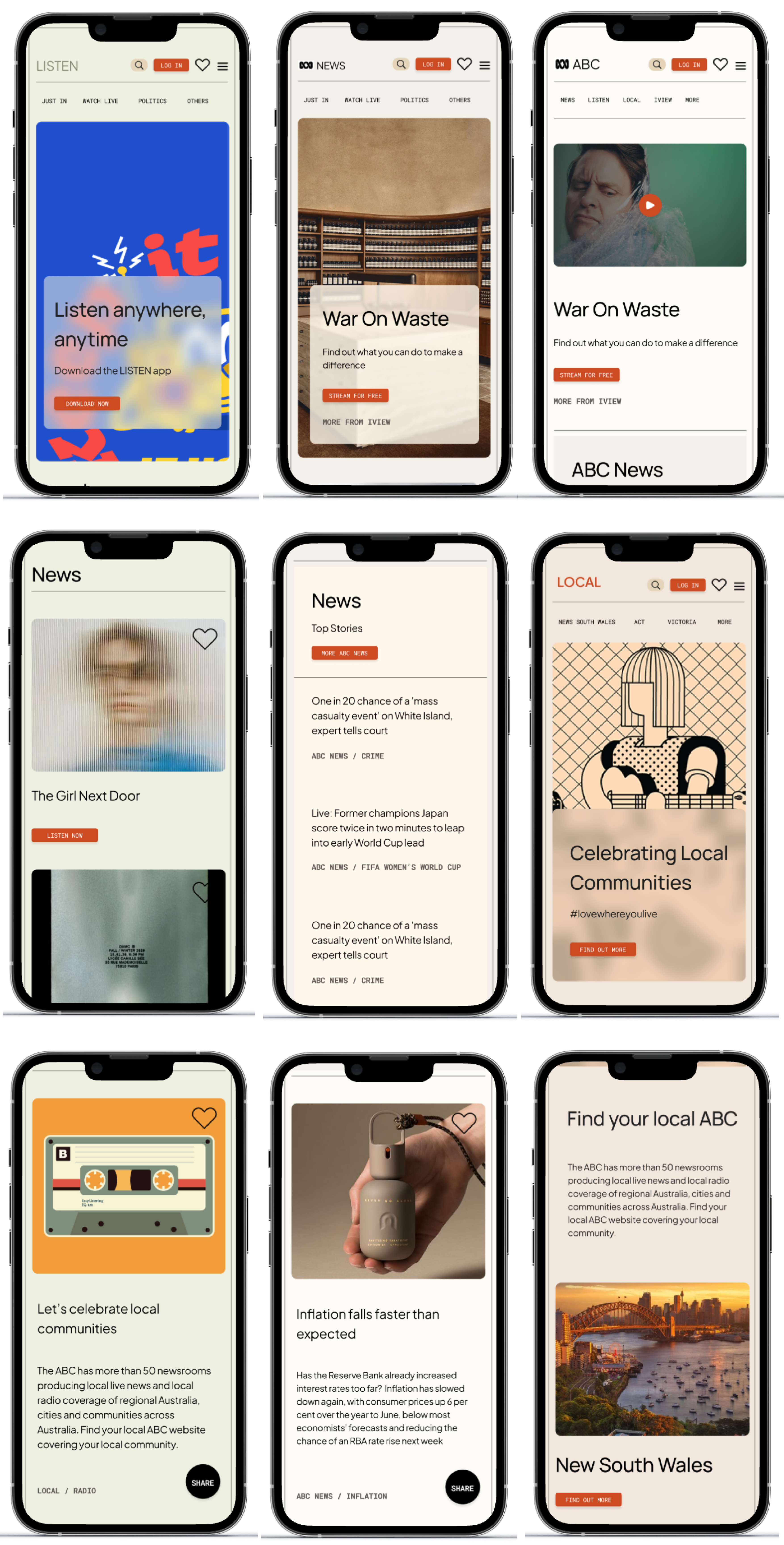
Site Map

To enhance the navigation system on the ABC News homepage, I utilised the open card sorting method to organize the information architecture. This method enabled brainstorming and logical grouping, leading to a user-friendly site map. By prioritising clarity and ease of navigation, we improved the user experience, allowing visitors to effortlessly discover and engage with content on the ABC News website.

ABC News Site Map

Design Decision

In our updated design for the ABC News website, our main goal is to ensure ease of readability and navigation for all users. We opt for clear fonts and ample spacing between elements to facilitate comfortable reading, benefiting users of all abilities, including those with visual impairments.

Similarly, when curating our Autumn Vintage mood-board, our primary focus is on enhancing user-friendliness by selecting colours that capture the cozy allure of the fall season. We incorporate deep reds and oranges to evoke warmth, while mustard yellow, olive green, and warm browns add depth and visual appeal. Additionally, softer tones like mauve, pink, and green contribute to a vintage aesthetic, inviting users to indulge in the nostalgic ambiance of autumn.

UI Style Guide

ABC News UI Style Guide ABC News UI Style Guide

Typography

ABC News Typography

Responsive Grids

Using a responsive grid design improves accessibility and ensures easy adaptation across different devices. By employing fluid grids and flexible layouts, content can adjust dynamically to various screen sizes and resolutions. This approach enhances user experience, enabling individuals to access and interact with the website or application comfortably, regardless of the device they're using. Additionally, integrating responsive design principles promotes inclusivity by catering to users with diverse accessibility needs, such as those who rely on screen readers or have limited dexterity. Overall, a responsive grid design fosters usability and guarantees a consistent and intuitive experience across all devices.

ABC News Responsive Grids

UX Design

Interaction Design

Following extensive research and analysis of design patterns aligning with information architecture, business objectives, and user requirements, I conceptualised solutions. Employing rapid prototyping, I iteratively refined ideas, prioritising addressing "How Might We" questions. Ensuring compliance with WCAG 2.0 and Apple Human Interface Guidelines, I transitioned from initial sketches to wireframe solutions and screen designs using Figma.

Wire-framing

ABC News Wire-framing

Branding

ABC News Branding

Final UI Design: Desktop

ABC News Final UI Design: Desktop ABC News Final UI Design: Desktop

Final UI Design: Mobile

ABC News Final UI Design: Mobile

Prototyping & Testing

Click the photo to explore the Desktop's Hi-Fi prototype.

ABC News Prototyping & Testing

Click the photo to explore the Mobile's Hi-Fi prototype.

ABC News Prototyping & Testing

Usability Testing

Following the finalisation of the high-fidelity prototype, a Usability Test Guide was prepared and suggested. Participants from various backgrounds were enlisted to partake in a virtual usability examination conducted via Zoom.

Four usability assessments were carried out using the hi-fidelity prototype of both the ABC News mobile and desktop versions

Five tasks were devised to evaluate usability and key objectives of the feature, including finding articles to read, comprehending the navigation drop-down menu, listening to podcasts, watching content on iview, liking articles, and sharing articles with friends.

The objectives of the tests were as follows:

Identify significant errors or incomplete task flows within the app

Assess user encounters with navigation or design obstacles

Recognise effective task flows and identify helpful UI features

Determine whether pertinent information is easily accessible at the appropriate time and location

Feedbacks & Iterations

Hamburger Menu Bar

Eliminated duplicate Editorial Policies button and link.

Aligned background colour with Local page for consistency.

Streamlined design by removing redundant lines for improved usability and spacing.

Adjusted width for responsive web design, ensuring compatibility with iPhone screens.

ABC News Hamburger Menu Bar

Navigation

Removed "X" button from top right corner.

Added hover state for drop-down menu with secondary categories.

Implemented hover state with orange underline and bold font for improved visibility.

ABC News Navigatio

Share Button

After several rounds of user testing, it became evident that users were experiencing confusion with the share button, particularly with the transition from an add icon to an arrow icon. This led to misunderstandings, as users initially perceived the button as expanding the article. After careful consideration, I ultimately decided to replace the icon with a "share" button, which resulted in a marked improvement in usability during testing.

ABC News Share Button

Conclusion

Through extensive usability testing and feedback analysis, we have gained valuable insights into the strengths and areas for improvement of the ABC News website. Our user-entered approach has allowed us to identify critical errors, assess navigation challenges, and recognise successful task flows. We have ensured that relevant information is presented effectively, contributing to a more intuitive and user-friendly experience for our audience.

Next Step

Building upon the findings from usability testing, our next step is to implement iterative design changes to address identified issues and enhance user satisfaction further. This includes refining navigation elements, optimising content layout, and integrating user-friendly features. Additionally, we will continue to monitor user feedback and conduct usability tests regularly to ensure ongoing improvement and alignment with user needs and preferences. Our ultimate goal is to create a seamless and engaging digital platform that provides users with easy access to reliable news content.

ABC News Conclusion